install.packages("swirl")   # Install swirl (once if not installed)

library("swirl")            # Load the swirl package to make it available for you to use
swirl() # Start swirlComputational Biology | Protocols general info
Hands-on Protocols
Welcome to Module 1 of the Computational Biology class. This course is ambitious. You will be challenged to learn many new concepts in a short amount of time. Do not hesitate to ask for help in order to gain the most out of these classes.
These classes are organized by protocols to be completed on each day:
- first you will get a brief introduction to R programming;
- then you will practice R by analysing a dataset using descriptive statistics, and learning some plotting functions to visualize the data;
- you will have a self-assessment exam to test your newly acquired R programming knowledge, and identify possible difficulties;
- finally, you will proceed with a Mini-project where you will perform a brief Exploratory Data Analysis (EDA) using R.
Keep calm and stay curious.
Introduction to R
- First, we will discuss the purpose of learning to program in R.
- Then, you will be introduced on how to install and use R and RStudio.
- Next, you will follow an interactive learning tutorial, self-paced, using the
swirlpackage. - Finally, you will recap some important notes about R programming.
Questions to debate in class:
- Why do we need to use computer programming?
- Why do we use R?
- Are there other alternatives to R?
1. Using RStudio
The practical classes for this course require R and RStudio.
Please read the tab “Software requirements” to get information on how to install R and RStudio in your system, or how to use your RStudio Server account from the virtual machines at UAlg.
The friendliest way to learn R is to use RStudio which is an Integrated Development Environment - IDE - that includes:
- a text editor with syntax-highlighting (where you save the R code in a script to run again in the future);
- an R console to execute code (where the R instructions are executed and evaluated to generate the output);
- a workspace and history management;
- and tabs to visualize plots and exporting images, browsing the files in the workspace, managing packages, getting help with functions and packages, and viewing html/pdf or presentation files created within RStudio (using RMarkdown).
2. Load the swirl package & Follow the guided course
After you become familiarized with RStudio, we shall progress to the interactive, self-paced, hands-on tutorial provided by the swirl package. You will learn R inside R. For more info about this package, visit: https://swirlstats.com/
Type these instructions in the R console (panel number 2 of RStudio). The words after a # sign are called comments, and are not interpreted by R, so you do not need to copy them.
You can copy-paste the code, and press enter after each command.
After starting swirl, follow the instructions given by the program, and complete all of the following lessons:
Please install the course:
1: R Programming: The basics of programming in R
Choose the course:
1: R Programming
Complete the following lessons, in this order:
1: Basic Building Blocks
3: Sequences of Numbers
4: Vectors
5: Missing Values
6: Subsetting Vectors
7: Matrices and Data Frames
8: Logic
12: Looking at Data
15: Base Graphics
Please call the instructor for any question, or if you require help.
Now, just Keep Calm… and Good Work!
Review & Extra notes about R and RStudio
After finishing the introduction to R with swirl, please recall the following information and hints about R and R programming.
R is case sensitive - be aware of capital letters (b is different from B).
All R code lines starting with the # (hash) sign are interpreted as comments, and therefore are not evaluated.
# This is a comment
# 3 + 4   # this code is not evaluated, so and it does not print any result
2 + 3     # the code before the hash sign is evaluated, so it prints the result (value 5)
[1] 5- Expressions in R are evaluated from the innermost parenthesis toward the outermost one (following proper mathematical rules).
# Example with parenthesis:
((2+2)/2)-2
[1] 0# Without parenthesis:
2+2/2-2[1] 1Spaces in variable names are not allowed — use a dot
.or underscore_to create longer names to make the variables more descriptive, e.g.my.variable_name.Spaces between variables and operators do not matter:
3+2is the same as3 + 2, andfunction (arg1 , arg2)is the same asfunction(arg1,arg2).A new line (enter) ends one command in R. If you want to write 2 expressions/commands in the same line, you have to separate them by a
;(semi-colon).
#Example:
3 + 2 ; 5 + 1
[1] 5[1] 6- To access the help pages on R functions, just type
help(function_name)or?function_name.
# Example: open the documentation about the function sum
help (sum)
# Quick access to help page about sum
?sum
RStudio auto-completes your commands by showing you possible alternatives as soon as you type 3 consecutive characters. If you want to see the options for less than 3 chars to get help on available functions, just press tab to display available options. Tip: Use auto-complete as much as possible to avoid typing mistakes.
There are 4 main vector data types in R: Logical (TRUE or FALSE); Numeric (e.g. 1,2,3…); Character (i.e. text, for example “universidade”, “do”, “Algarve”) and Complex (e.g. 3+2i).
Vectors are ordered sets of elements. In R vectors are 1-based, i.e. the first index position is number 1 (as opposed to other programming languages whose indexes start at zero, like Python).
R objects can be divided in two main groups: Functions and Data-related objects. Functions receive arguments inside circular brackets
( )and objects receive arguments inside square brackets[ ]:function (arguments)
data.object [arguments]There are five basic data structures in R:
Vector,Matrix,Array,Data frame, andList(see following figure):
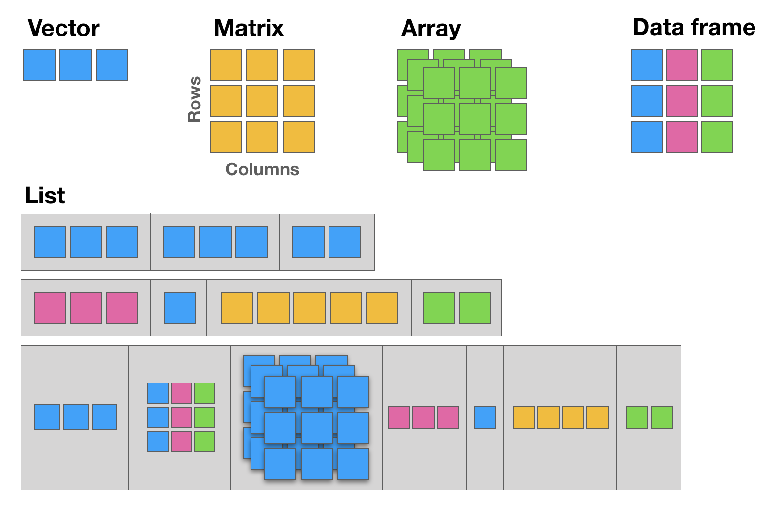
12.1 The basic data structure in R is the vector, which requires all of its elements to be of the same type (e.g. all numeric; all character (text); all logical (TRUE or FALSE)).
12.2 Matrices are two dimensional vectors (tables), where all columns are of the same length, and all from the same type.
12.3 Data frames are the most flexible and commonly used R data structures, used to store datasets in spreadsheet-like tables. The columns can be vectors of different types (i.e. text, number, logical, etc, can all be stored in the same data frame), but each column must to be of the same data type.
12.4 Lists are ordered sets of elements, that can be arbitrary R objects (vectors, data frames, matrices, strings, functions, other lists etc), and heterogeneous, i.e. each element can be of a different type and different lengths.
- R is column-major by default, meaning that the elements of a multi-dimensional array are linearly stored in memory column-wise. This is important for example when using data to populate a
matrix.
matrix(1:9, ncol = 3) [,1] [,2] [,3]
[1,] 1 4 7
[2,] 2 5 8
[3,] 3 6 9- When subsetting matrices and data-frames, the first index is the row, and the second index is the column. If left empty (no value), then the full row or the full column is returned.
# My letters matrix
(my_letters <- matrix(rep(LETTERS[1:3], each=3), ncol = 3))
[,1] [,2] [,3]
[1,] "A" "B" "C"
[2,] "A" "B" "C"
[3,] "A" "B" "C" # Element in Row 1, Column 2
my_letters[1,2][1] "B"# Element in Row 2, Column 3
my_letters[2,3][1] "C"# Row 3
my_letters[3,][1] "A" "B" "C"# Column 1
my_letters[,1][1] "A" "A" "A"R For Absolute Beginners Tutorial
NOTE | This tutorial is just for FUTURE study, NOT to complete in class.
In the following tab, you will find a brief introductory R tutorial covering key concepts such as fundamental syntax, core data structures (vectors, matrices, data frames, lists, and factors), control flow with loops and conditionals, function declaration, and commonly used built-in functions.
This is useful for future self-paced learning, and it includes extra concepts and programming tasks that are not part of the Computational Biology class, but they are useful if you want to learn more about R, and continue to use it for your future research data analyses.
R4AB | Hands on tutorial
This mini hands-on tutorial serves as an introduction to basic R, covering the following topics:
- Packages, Documentation and Help;
- Basics and syntax of R;
- Main R data structures: Vectors, Matrices, Data frames, Lists, and Factors;
- Brief intro to R control-flow via Loops and Conditionals;
- Brief description of function declaration;
- Listing of some of the most commonly used built-in functions in R.
Tutorial organization
This protocol is divided into 7 parts, each one identified by a Title, Maximum execution time (in parenthesis), a brief Task description and the R commands to be executed. These will always be inside grey text boxes, with the font colored according to the R syntax highlighting.
Self-paced tutorial
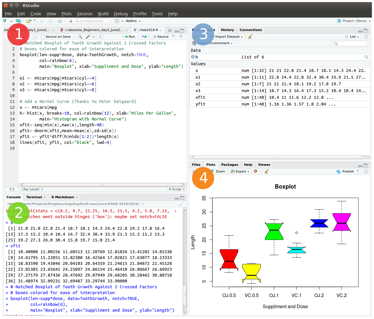
Create an RStudio project (30 min)
To start we will open RStudio. This is an Integrated Development Environment - IDE - that includes syntax-highlighting text editor (1 in Figure1), an R console to execute code (2 in Figure1), as well as workspace and history management (3 in Figure1), and tools for plotting and exporting images, browsing the workspace, managing packages and viewing html/pdf files created within RStudio (4 in Figure1).
Projects are a great functionality, easing the transition between different dataset analyses, and allowing a fast navigation to your analysis/working directory. To create a new project:
File > New Project... > New Directory > New Project
Directory name: r_absolute_beginners
Create project as a subdirectory of: ~/
                           Browse... (directory/folder to save the workshop data)
Create Project
Projects should be personalized by clicking on the menu in the right upper corner. The general options - R General - are the most important to customize, since they allow the definition of the RStudio “behavior” when the project is opened. The following suggestions are particularly useful:
Restore .RData at startup - No (for analyses with +1GB of data, you should choose "No")
Save .RData on exit - Ask
Always save history - Yes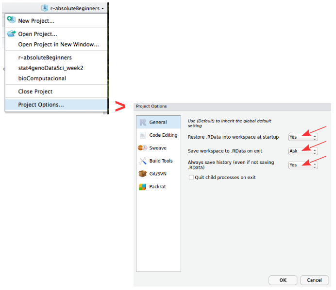
Working directory
The working directory is the location in the filesystem (folder) where R will look for input data and where it will save the output from your analysis. In RStudio you can graphically check this information.
dir()   # list all files in your working directory
getwd() # find out the path to your working directory
setwd("/home/isabel") # example of setting a new working directory path
Saving your workspace in R
The R environment is controlled by hidden files (files that start with a dot .) in the start-up directory: .RData, .Rhistory and .Rprofile (optional).
- .RData is a file containing all the objects, data, and functions created during a work-session. This file can then be loaded for future work without requiring the re-computation of the analysis. (Note: it can potentially be a very large file);
- .Rhistory saves all commands that have been typed during the R session;
- .Rprofile useful for advanced users to customize RStudio behavior.
These files can be renamed:
# DO NOT RUN
save.image (file=“myProjectName.RData”)
savehistory (file=“myProjectName.Rhistory”)
To quit R just close RStudio, or use the q () function. You will then be asked if you want to save the workspace image (i.e. the .RData file):
q()Save workspace image to ~/path/to/your/working/directory/.RData? [y/n/c]:
If you type y (yes), then the entire R workspace will be written to the .RData file (which can be very large). Often it is sufficient to just save an analysis script (i.e. a reproducible protocol) in an R source file. This way, one can quickly regenerate all data sets and objects for future analysis. The .RData file is particularly useful to save the results from analyses that require a long time to compute.
In RStudio, to quit your session, just hit the close button (x button), just like when you want to quit any other application in your computer.
Package repositories
In R, the fundamental unit of shareable code is the package. A package bundles together code, data, documentation, and tests, and is easy to share with others. These packages are stored in online repositories from which they can be easily retrieved and installed on your computer (R packages by Hadley Wickham). There are 2 main R repositories:
- The Comprehensive R Archive Network - CRAN (23291 packages in March 2026)
- Bioconductor (2361 packages in March 2026) (bioscience data analysis)
This huge variety of packages is one of the reasons why R is so successful: the chances are that someone has already developed a method to solved the problem that you’re working on, and you can benefit from their work by downloading their package for free.
In this course, we will not use many packages. However, if you continue to use R for your data analyses you will need to install many more useful packages, particularly from Bioconductor — an open source, open development software project to provide tools for the analysis and comprehension of high-throughput genomics data.
How to Install and Load packages
There are several alternative ways to install packages in R. Depending on the repository from which you want to install a package, there are dedicated functions that facilitate this task:
install.packages()built-in function to install packages from the CRAN repository;BiocManager::install()to install packages from the Bioconductor repository;remotes::install_githubto install packages from GitHub (a code repository, not dedicated to R);pak::pkg_install()thepakpackage installs packages from CRAN, Bioconductor and even github and other remote repositories.
After installing a package, you must load it to make its contents (functions and/or data) available. The loading is done with the function library(). Alternatively, you can prepend the name of the package followed by :: to the function name to use it (e.g. ggplot2::qplot()).
# install.packages("ggplot2")   # install the package ggplot2 (if not installed)
library ("ggplot2")            # load the library ggplot2

help (package=ggplot2)         # help(package="package_name") to get help about any package
vignette ("ggplot2")           # show a pdf with the package manual (called R vignettes)
Operators (60 min)
Important NOTE: Please create a new R Script file to save all the code you use for today’s tutorial and save it in your current working directory. Name it: r4ab_day1.R
Arithmetic operators
R makes calculations using the following arithmetic operators:
| Symbol | Description |
|---|---|
+ |
summation |
- |
subtraction |
* |
multiplication |
/ |
division |
^ |
power |
3 / y   ## 0.3333333
x * 2   ## 14
3 - 4   ## -1
2^z     ## 8
my_variable + 2   ## 7
Assignment operators
Values are assigned to named variables with an <- (arrow) or an = (equal) sign. In most cases they are interchangeable, however it is good practice to use the arrow since it is explicit about the direction of the assignment. If the equal sign is used, the assignment occurs from left to right.
| Symbol | Description |
|---|---|
= |
Leftward assignment* |
<- |
Leftward assignment* |
-> |
Rightward assignment** |
* The value on the right is assigned to the variable on the left. ** The value on the left is assigned to the variable on the right.
x <- 7     # assign the number 7 to a variable named x
x          # R will print the value associated with variable x

y <- 9     # assign the number 9 to the variable y

z = 3      # assign the value 3 to the variable z

42 -> lue  # assign the value 42 to the variable named lue

x ->  xx   # assign the value of x (which is the number 7) to the variable named xx
xx         # print the value of xx

my_variable = 5   # assign the number 5 to the variable named my_variable
Comparison operators
Allow the direct comparison between values, and its result is always a TRUE or FALSE value:
| Symbol | Description |
|---|---|
== |
exactly the same (equal) |
!= |
different (not equal) |
< |
smaller than |
> |
greater than |
<= |
smaller or equal |
>= |
greater or equal |
1 == 1   # TRUE
1 != 1   # FALSE
x > 3    # TRUE (x is 7)
y <= 9   # TRUE (y is 9)
my_variable < z   # FALSE (z is 3 and my_variable is 5)
Logical operators
Compare logical (TRUE or FALSE) values:
| Symbol | Description |
|---|---|
& |
AND (vectorized) |
&& |
AND (non-vectorized/evaluates only the first value) |
| |
OR (vectorized) |
|| |
OR (non-vectorized/evaluates only the first value) |
! |
NOT |
QUESTION: Are these TRUE, or FALSE?
x < y & x > 10   # AND means that both expressions have to be true to return TRUE
x < y | x > 10   # OR means that only one expression must be true to return TRUE
!(x != y & my_variable <= y)  # yet another AND example using NOT
The forward pipe operator
A pipe expression passes, or pipes, the result of the left-hand-side expression (lhs) to the right-hand-side expression (rhs): lhs |> rhs.
The lhs is inserted as the first argument in the call. So x |> f(y) is interpreted as f(x, y).
| Symbol | Description |
|---|---|
|> |
Pipe |
Data structures (120 min)
R has 5 basic data structures (see following figure).
Vectors
The basic data structure in R is the vector, which requires all of its elements to be of the same type (e.g. all numeric; all character (text); all logical (TRUE or FALSE)).
Creating vectors
| Function | Description |
|---|---|
c |
combine |
: |
integer sequence |
seq |
general sequence |
rep |
repetitive patterns |
x <- c (1,2,3,4,5,6)
x
class (x)   # this function outputs the class of the object

y <- 10
class (y)

z <- "a string"
class (z)
# The results are shown in the comments next to each line
seq (1,6) ## 1 2 3 4 5 6
seq (from=100, by=1, length=5) ## 100 101 102 103 104
1:6 ## 1 2 3 4 5 6
10:1 ## 10 9 8 7 6 5 4 3 2 1
rep (1:2, 3) ## 1 2 1 2 1 2Vectorized arithmetics
Most arithmetic operations in the R language are vectorized, i.e. the operation is applied element-wise. When one operand is shorter than the other, the shortest one is recycled, i.e. the values from the shorter vector are re-used until the length of the longer vector is reached.
Please note that when one of the vectors is recycled, a warning is printed in the R Console. This warning is not an error, i.e. the operation has been completed despite the warning message.
1:3 + 10:12

# Notice the warning: this is recycling (the shorter vector "restarts" the "cycling")
1:5 + 10:12

x + y         # Remember that x = c(1,2,3,4,5,6) and y = 10
c(70,80) + x
Subsetting/Indexing vectors
Subsetting is one of the most powerful features of R. It is the extraction of one or more elements, which are of interest, from vectors, allowing for example the filtering of data, the re-ordering of tables, removal of unwanted data-points, etc. There are several ways of sub-setting data.
Note: Please remember that indices in R are 1-based (see introduction).
# Subsetting by indices
myVec <- 1:26 ; myVec
myVec [1]    # prints the first value of myVec
myVec [6:9]  # prints the 6th, 7th, 8th, and 9th values of myVec

# LETTERS is a built-in vector with the 26 letters of the alphabet
myLOL <- LETTERS       # assign the 26 letters to the vector named myLOL
myLOL[c(3,3,13,1,18)]  # print the requested positions of vector myLOL

#Subsetting by same length logical vectors
myLogical <- myVec > 10 ; myLogical
# returns only the values in positions corresponding to TRUE in the logical vector
myVec [myLogical]
Naming indexes of a vector
Referring to an index by name rather than by position can make code more readable and flexible. Use the function names to attribute names to each position of the vector.
joe <- c (24, 1.70)
names (joe)              ## NULL
names (joe) <- c ("age","height")
names (joe)              ## "age"    "height"
joe ["age"] == joe [1]   ## age   TRUE

names (myVec) <- LETTERS
myVec
# Subsetting by field names
myVec [c("A", "A", "B", "C", "E", "H", "M")] ## The Fibonacci Series :o)
Excluding elements
Sometimes we want to retain most elements of a vector, except for one or a few unwanted positions. Instead of specifying all elements of interest, it is easier to specify the ones we want to remove. This is easily done using the minus sign.
alphabet <- LETTERS
alphabet   # print vector alphabet
vowel.positions <- c(1,5,9,15,21)
alphabet[vowel.positions]    # print alphabet in vowel.positions

consonants <- alphabet [-vowel.positions]  # exclude all vowels from the alphabet
consonants
Matrices
Matrices are two dimensional vectors (tables), where all columns are of the same length, and, just like one-dimensional vectors, matrices store same-type elements (e.g. all numeric; all character (text); all logical (TRUE or FALSE)). Matrices are explicitly created with the matrix function.
IMPORTANT NOTE: R uses a column-major order for the internal linear storage of array values, meaning that first all of column 1 is stored, then all of column 2, etc. This implies that, by default, when you create a matrix, R will populate the first column, then the second, then the third, and so on until all values given to the matrix function are used. This is the default behavior of the matrix function, which can be changed via the byrow parameter (default value is set to FALSE).
my.matrix <- matrix (1:12, nrow=3, byrow = FALSE)   # byrow = FALSE is the default (see ?matrix)
dim (my.matrix)   # check the dimension (size) of the matrix: number of rows (first number) and number of columns (second number)
my.matrix         # print the matrix

xx <- matrix (1:12, nrow=3, byrow = TRUE)
dim (xx)  # check if the dimensions of xx are the same as the dimensions of my.matrix
xx        # compare my.matrix with xx and make sure you understand what is hapenning
Subsetting/Indexing matrices
Very Important Note: The arguments inside the square brackets in matrices (and data.frames - see next section) are the [row_number, column_number]. If any of these is omitted, R assumes that all values are to be used: all rows, if the first value before the comma is missing; or all columns if the second value after the comma is missing.
# Creating a matrix of characters
my.matrix <- matrix (LETTERS, nrow = 4, byrow = TRUE)
# Please notice the warning message (related to the "recycling" of the LETTERS)

my.matrix         # print the matrix
dim (my.matrix)   # check the dimensions of the matrix

# Subsetting by indices
my.matrix [,2]   # all rows, column 2 (returns a vector)
my.matrix [3,]   # row 3, all columns (returns a vector)
my.matrix [1:3,c(4,2)]   # rows 1, 2 and 3 from columns 4 and 2 (by this order) (returns a matrix)
Data frames
Data frames are the most flexible and commonly used R data structures, used to store datasets in spreadsheet-like tables.
In a data.frame, usually the observations are the rows and the variables are the columns. Unlike matrices, the columns of a data frame can be vectors of different types (i.e. text, number, logical, etc, can all be stored in the same data frame). However, each column must to be of the same data type.
df <- data.frame (type=rep(c("case","control"),c(2,3)),time=rnorm(5))
# rnorm is a random number generator retrieved from a normal distribution

class (df)   ## "data.frame"
df
Subsetting/Indexing Data frames
Data frames are easily subset by index number using the square brackets notation [], or by column name using the dollar sign $.
Remember: The arguments inside the square brackets, just like in matrices, are the [row_number, column_number]. If any of these is omitted, R assumes that all values are to be used.
NOTE: R includes a package in its default base installation, named “The R Datasets Package”. This resource includes a diverse group of datasets, containing data from different fields: biology, physics, chemistry, economics, psychology, mathematics. These data are very useful to learn R. For more info about these datasets, run the following command: library(help=datasets)
Here we will use the classic iris dataset to explore data frames, and learn how to subset them.
# Familiarize yourself with the iris dataset (built-in dataset with measurements of iris flowers)
iris

# Subset by indices the iris dataset
iris [,3]   # all rows, column 3
iris [1,]   # row 1, all columns
iris [1:9, c(3,4,1,2)]   # rows 1 to 9 with columns 3, 4, 1 and 2 (in this order)

# Subset by column name (for data.frames)
iris$Species            #show only the species column
iris[,"Sepal.Length"]

# Select the time column from the df data frame created above
df$time      ## 0.5229577 0.7732990 2.1108504 0.4792064 1.3923535
Lists
Lists are very powerful data structures, consisting of ordered sets of elements, that can be arbitrary R objects (vectors, strings, functions, etc), and heterogeneous, i.e. each element of a different type.
lst = list (a=1:3, b="hello", fn=sqrt)   # index 3 contains the function "square root"
lst
lst$fn(49)   # outputs the square root of 49
Subsetting/Indexing lists
Like data frames they can be subset both by index number (inside square brackets) or by name using the dollar sign.
NOTE: There is one subsetting feature that is particular to lists, which is the possibility of indexing using single square brackets [ ], or double square-brackets [[ ]]. The difference between these are the fact that, single brackets always return a list, while double brackets return the object in its native type (the same occurs with the dollar sign). For example, if the 3rd element of my.list is a data frame, then indexing the list using my.list[3] will return a list, of size 1 storing a data frame; but indexing it using my.list[[3]] will return the data frame itself.
# Subsetting by indices
lst [1]     # returns a list with the data contained in position 1 (preserves the type of data as list)
class (lst[1])

lst [[1]]   # returns the data contained in position 1 (simplifies to inner data type)
class(lst[[1]])

# Subsetting by name
lst$b       # returns the data contained in position 1 (simplifies to inner data type)
class(lst$b)

# Compare the class of these alternative indexing by name
lst["a"]
lst[["a"]]
Factors
Factors are variables in R which take on a limited number of different values - such variables are often refered to as categorical variables.
“One of the most important uses of factors is in statistical modeling; since categorical variables enter into statistical models differently than continuous variables, storing data as factors insures that the modeling functions will treat such data correctly.
Factors in R are stored as a vector of integer values with a corresponding set of character values to use when the factor is displayed. The factor function is used to create a factor. The only required argument to factor is a vector of values which will be returned as a vector of factor values. Both numeric and character variables can be made into factors, but a factor’s levels will always be character values. You can see the possible levels for a factor through the levels command.
Factors represent a very efficient way to store character values, because each unique character value is stored only once, and the data itself is stored as a vector of integers.” Because of this, read.table used to convert character variables to factors by default. Since version X of R this has changed, and now the argument stringsAsFactors = FALSE is the default.
(Adapted from: https://www.stat.berkeley.edu/~s133/factors.html)
# Create a vector of numbers to be displayed as Roman Numerals
my.fdata <- c(1,2,2,3,1,2,3,3,1,2,3,3,1)
# look at the vector
my.fdata

# turn the data into factors
factor.data <- factor(my.fdata)
# look at the factors
factor.data

# add labels to the levels of the data
labeled.data <- factor(my.fdata,labels=c("I","II","III"))
# look at the factors
labeled.data
# look only at the levels (i.e. character labels) of the factors
levels(labeled.data)
Data structure conversion
Data structures can be inter-converted (coerced) from one type to another. Sometimes it is useful to convert between data structure types (particularly when using packages).
NOTE: Such conversions are not always possible without information loss - for example converting a data frame with mix data types to a matrix is not possible without converting all columns to the same type, possibly leading to losses.
R has several functions for data structure conversions:
# To check the class of the object:
class(lst)

# To check the basic structure of an object:
str(lst)

# "Force" the object to be of a certain type:
 # (this is not valid code, just a syntax example)
as.matrix (myDataFrame)  # convert a data frame into a matrix
as.numeric (myChar)      # convert text characters into numbers
as.data.frame (myMatrix) # convert a matrix into a data frame
as.character (myNumeric) # convert numbers into text chars
Loops and Conditionals in R (60 min)
for () and while () loops
R allows the implementation of loops, i.e. replicating instructions in an iterative way (also called cycles). The most common ones are for () loops and while () loops. The syntax for these loops is: for (condition) { code-block } and while (condition) { code-block }.
# creating a for loop to calculate the first 12 values of the Fibonacci sequence
my.x <- c(1,1)
for (i in 1:10) {
  my.x <- c(my.x, my.x[i] + my.x[i+1])
  print(my.x)
}

# while loops will execute a block of commands until a condition is no longer satisfied
x <- 3 ; x
while (x < 9)
{
  cat("Number", x, "is smaller than 9.\n") # cat is a printing function (see ?cat)
   x <- x+1
}
Conditionals: if () statements
Conditionals allow running commands only when certain conditions are TRUE. The syntax is: if (condition) { code-block }.
x <- -5 ; x
if (x >= 0) { print("Non-negative number") } else { print("Negative number") }
 # Note: The else clause is optional. If the command is run at the command-line,
  # and there is an else clause, then either all the expressions must be enclosed
  # in curly braces, or the else statement must be in line with the if clause.

# coupled with a for loop
x <- c(-5:5) ; x
for (i in 1:length(x)) {
  if (x[i] > 0) {
     print(x[i])
  }
  else {
   print ("negative number")
  }
}
Conditionals: ifelse () statements
The ifelse function combines element-wise operations (vectorized) and filtering with a condition that is evaluated. The major advantage of the ifelse over the standard if-then-else statement is that it is vectorized. The syntax is: ifelse (condition-to-test, value-for-true, value-for-false).
# re-code gender 1 as F (female) and 2 as M (male)
gender <- c(1,1,1,2,2,1,2,1,2,1,1,1,2,2,2,2,2)
ifelse(gender == 1, "F", "M")
Functions (60 min)
R allows defining new functions using the function command. The syntax (in pseudo-code) is the following:
my.function.name <- function (argument1, argument2, ...) {
  expression1
  expression2
  ...
  return (value)
  }
Now, lets code our own function to calculate the average (or mean) of the values from a vector:
# Define the function
    # Please note that the function must be declared in the script before it can be used
my.average <- function (x) {
  average.result <- sum(x)/length(x)
  return (average.result)
}

# Create the data vector
my.data <- c(10,20,30)

# Run the function using the vector as argument
my.average(my.data)

# Compare with R built-in mean function
mean(my.data)
Loading data and Saving files (30 min)
Most R users need to load their own datasets, usually saved as table files (e.g. Excel, or .csv files), to be able to analyse and manipulate them. After the analysis, the results need to be exported/saved (e.g. to view or use with other software).
# Inspect the esoph built-in dataset
esoph
dim(esoph)
colnames(esoph)

### Saving ###
# Save to a file named esophData.csv the esoph R dataset, separated by commas and
 # without quotes (the file will be saved in the current working directory)
write.table (esoph, file="esophData.csv", sep="," , quote=F)

# Save to a file named esophData.tab the esoph dataset, separated by tabs and without
 # quotes (the file will be saved in the current working directory)
write.table (esoph, file="esophData.tab", sep="\t" , quote=F)

### Loading ###
# Load a data file into R (the file should be in the working directory)
  # read a table with columns separated by tabs
my.data.tab <- read.table ("esophData.tab", sep="\t", header=TRUE)
 # read a table with columns separated by commas
my.data.csv <- read.csv ("esophData.csv", header=T)
Note: if you want to load or save the files in directories different from the working directory, just use (inside quotes) the full path as the first argument, instead of just the file name (e.g. “/home/Desktop/r_Workshop/esophData.csv”).
Some great R functions to “play” with (60 min)
Using the iris buil-in dataset
# the unique function returns a vector with unique entries only (remove duplicated elements)
unique (iris$Sepal.Length)

# length returns the size of the vector (i.e. the number of elements)
length (unique (iris$Sepal.Length))

# table counts the occurrences of entries (tally)
table (iris$Species)

# aggregate computes statistics of data aggregates (groups)
aggregate (iris[,1:4], by=list (iris$Species), FUN=mean, na.rm=T)

# the %in% function returns the intersection between two vectors
month.name [month.name %in% c("CCMar","May", "Fish", "July", "September","Cool")]

# merge joins data frames based on a common column (that functions as a "key")
df1 <- data.frame(x=1:5, y=LETTERS[1:5]) ; df1
df2 <- data.frame(x=c("Eu","Tu","Ele"), y=1:6) ; df2
merge (df1, df2, by.x=1, by.y=2, all = TRUE)

# cbind and rbind (takes a sequence of vector, matrix or data-frame arguments
 # and combine them by columns or rows, respectively)
my.binding <- as.data.frame(cbind(1:7, LETTERS[1:7]))    # the '1' (shorter vector) is recycled
my.binding
my.binding <- cbind(my.binding, 8:14)[, c(1, 3, 2)] # insert a new column and re-order them
my.binding

my.binding2 <- rbind(seq(1,21,by=2), c(1:11))
my.binding2

# reverse the vector
rev (LETTERS)
# sum and cumulative sum
sum (1:50); cumsum (1:50)
# product and cumulative product
prod (1:25); cumprod (1:25)

### Playing with some R built-in datasets (see library(help=datasets) )
iris   # familiarize yourself with the iris data

# mean, standard deviation, variance and median
mean (iris[,2]); sd (iris[,2]); var (iris[,2]); median (iris[,2])

# minimum, maximum, range and summary statistics
min (iris[,1]); max (iris[,1]); range (iris[,1]); summary (iris)

# exponential, logarithm
exp (iris[1,1:4]); log (iris[1,1:4])

# sine, cosine and tangent (radians, not degrees)
sin (iris[1,1:4]); cos (iris[1,1:4]); tan (iris[1,1:4])

# sort, order and rank the vector
sort (iris[1,1:4]); order (iris[1,1:4]); rank (iris[1,1:4])

# useful to be used with if conditionals
any (iris[1,1:4] > 2)   # ask R if there are any values higher that 2?
all (iris[1,1:4] > 2)   # ask R if all values are higher than 2

# select data
which (iris[1,1:4] > 2)
which.max (iris[1,1:4])

# subset data by values/patterns from different columns
subset(iris, Petal.Length >= 3 & Sepal.Length >= 6.5, select=c(Petal.Length, Sepal.Length, Species))
Using the esoph buil-in dataset
The esoph (Smoking, Alcohol and (O)esophageal Cancer data) built-in dataset presents 2 types of variables: continuous numerical variables (the number of cases and the number of controls), and discrete categorical variables (the age group, the tobacco smoking group and the alcohol drinking group). Sometimes it is hard to “categorize” continuous variables, i.e. to group them in specific intervals of interest, and name these groups (also called levels).
Accordingly, imagine that we are interested in classifying the number of cancer cases according to their occurrence: frequent, intermediate and rare. This type of variable re-coding into factors is easily accomplished using the function cut(), which divides the range of x into intervals and codes the values in x according to which interval they fall.
# subset non-contiguous data from the esoph dataset
esoph
summary(esoph)
# cancers in patients consuming more than 30 g/day of tobacco
subset(esoph$ncases, esoph$tobgp == "30+")
# total nr of cancers in patients older than 75
sum(subset(esoph$ncases, esoph$agegp == "75+"))

# factorize the nr of cases in 3 levels, equally spaced,
 # and add the new column named cat_ncases, to the dataset
esoph$cat_ncases <- cut (esoph$ncases,3,labels=c("rare","med","freq"))
summary(esoph)
The end
Descriptive statistics in R
To practice your newly acquired R skills, you will be doing a brief summary statistics analysis of a simple dataset.
The scientific experiment | You are interested in determining if a high-fat diet causes mice to gain weight, after one month. For this study, you obtained data from 60 mice, where half were fed a lean-diet, and the other half a high-fat diet. All other living conditions were the same. Four weeks after, all mice were weighted, and the sex and age were also recorded. The results were saved in
mice_data.txtfile.
Start by discussing the experimental design
- What is the research question? What is the hypothesis?
- How many variables are in the study?
- Which variable(s) are dependent? (Dependent or Response variables are the variables that we are interested in predicting or explaining.)
- Which variable(s) are independent? (Independent or Explanatory variables are used to explain or predict the dependent variable.)
- Which variable(s) are covariates? (Covariates are variables that are potentially related to the outcome of interest in a study, but are not the main variable under study - used to control for potential confounding factors in a study.)
- Are the “controls” appropriate? Why?
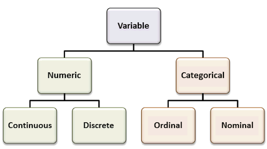
Recall the most common variable types. The types of the variables will define the analyses and visualizations that are possible.
Organize your data analysis project
To keep your files organized and easy to find, it’s a good idea to set up a clear naming system before you start collecting data for your thesis (or any other research-related data analysis).
A file naming convention is a consistent way to name files so it’s clear what’s inside and how each file connects to others. This helps you quickly understand and locate files, avoiding confusion or lost data later on.
1. Create a directory for the computatinal biology classes.
A key part of good data management is organizing your data effectively. This means planning how you’ll name files, arrange folders, and show relationships between them.
Researchers should set up folder structures that reflect how records were created and align with their workflows. Doing this improves clarity, makes it easier to save, find, and archive files, and supports collaboration across teams.
Establishing a clear file structure and naming system before collecting data ensures consistency and helps team members work more efficiently together.
We propose the following minimal structure inside a folder that identifies the :
project_nickname/
├── data/
│ ├── raw/
│ └── processed/
│ └── metadata/
├── scripts/
├── output/
└── docs/ - project_nickname: root folder for the Rproject (for example: r_comp_biol)
- data/raw: original, unmodified data
- data/processed: cleaned or transformed data ready for analysis
- data/metadata: description of the contents in the data folder (learn more about metadata)
- scripts: code for processing and analysis
- output: figures, tables, and final results
- docs: project documentation with supplementary files that are not data or analysis related
2. Create an RStudio project
RStudio Projects are a great functionality, easing the transition between dataset analyses, and allowing a fast navigation to your analysis/working directory. To create a new project:
File > New Project... > New Directory > New Project
Directory name: comp_biol_r
Create a project as a subdirectory of: ~/
                           Browse... (folder that you created for the computational biology classes)
Create Project
Projects should be personalized by clicking on the menu in the right upper corner. The general options - R General - are the most important to customize, since they allow the definition of the RStudio “behavior” when the project is opened. The following suggestions are particularly useful:
Restore .RData at startup - No (for analyses with +1GB of data, you should choose "No")
Save .RData on exit - Ask
Always save history - Yes
3. Create a new R script file
In order to save your work, you must create a new R script file. Go to File > New File > R Script. A blank text file will appear above the console. Save it to your project folder with the name comp_biol_mice.R
NoteWhy do we need scripts?
A script is a text file with a sequence of instructions that the computer runs to perform a task.
In R, you save the commands used in your analysis so you can run them again later. This makes your work reproducible, objective, and easy to update if the data change.
Although writing a script takes time at first, it allows you to work more efficiently in the long term. You can also share it with collaborators so they can review, improve, or extend your work. Many scientific journals now require authors to submit the analysis scripts with their manuscripts.
Load data and inspect it
- Download the file
mice_data.txt(mice weights according to diet) from here.
- Create a folder named
datainside your current working directory (where the RProject was created), and upload themice_data.txtto thedatafolder. - Type the instructions inside grey boxes in pane number 2 of RStudio - the R Console. As you already know, the words after a
#sign are comments not interpreted by R, so you do not need to copy them.- In the R console, you must hit
enterafter each command to obtain the result. - In the script file (R file), you must
runthe command by pressing the run button (on the top panel), or by selecting the code you want to run and pressingctrl + enter.
- In the R console, you must hit
- Save all your relevant/final commands (R instructions) to your script file to be available for later use.
# Load the file and save it to object mice_data
mice_data <- read.table(file="data/mice_data.txt",
                        header = TRUE,
                        sep = "\t",
                        dec = ".",
                        stringsAsFactors = TRUE)
# Briefly explore the dataset
View (mice_data) # Open a tab in RStudio showing the whole tablehead (mice_data, 10) # Show the first 10 rows diet weight gender age_months
1 lean 24.02 F 19
2 lean 21.79 F 17
3 lean 23.90 F 20
4 lean 11.15 M 10
5 lean 17.73 F 15
6 lean 12.89 M 12
7 lean 20.12 F 16
8 lean 23.04 F 18
9 lean 22.84 F 19
10 lean 18.92 M 15tail (mice_data, 10) # Show the last 10 rows diet weight gender age_months
51 fat 23.75 M 18
52 fat 21.84 M 17
53 fat 26.60 F 20
54 fat 21.13 M 17
55 fat 24.20 M 19
56 fat 30.69 M 23
57 fat 23.99 F 18
58 fat 19.35 M 17
59 fat 26.37 F 22
60 fat 28.84 M 20str(mice_data) # Describe the class of each column in the dataset'data.frame': 60 obs. of 4 variables:
$ diet : Factor w/ 2 levels "fat","lean": 2 2 2 2 2 2 2 2 2 2 ...
$ weight : num 24 21.8 23.9 11.2 17.7 ...
$ gender : Factor w/ 2 levels "F","M": 1 1 1 2 1 2 1 1 1 2 ...
$ age_months: int 19 17 20 10 15 12 16 18 19 15 ...summary (mice_data) # Get the summary statistics for all columns diet weight gender age_months
fat :30 Min. :10.62 F:30 Min. :10.00
lean:30 1st Qu.:19.24 M:30 1st Qu.:17.00
Median :22.79 Median :18.00
Mean :22.43 Mean :17.98
3rd Qu.:25.63 3rd Qu.:20.00
Max. :34.76 Max. :24.00 To facilitate further analysis, we will create 2 separate data frames: one for each type of diet.
# Filter the diet column by lean or fat and save results in a data frame
lean <- subset (mice_data, diet == "lean")
fat <- subset (mice_data, diet == "fat")

# Look at the new tables
head (lean)
diet weight gender age_months
1 lean 24.02 F 19
2 lean 21.79 F 17
3 lean 23.90 F 20
4 lean 11.15 M 10
5 lean 17.73 F 15
6 lean 12.89 M 12head (fat) diet weight gender age_months
31 fat 15.67 F 14
32 fat 28.18 M 22
33 fat 29.50 M 22
34 fat 23.89 M 20
35 fat 21.61 F 18
36 fat 25.53 M 21Descriptive statistics and Plots using R
Now, we should look at the distributions of the variables. First we will use descriptive statistics that summarize the sample data. We will use measures of central tendency: Mean, Median, and Mode, and measures of dispersion (or variability): Standard Deviation, Variance, Maximum, and Minimum.
# Summary statistics per type of diet - min, max, median, average, standard deviation and variance
summary(lean)      # quartiles, median, mean, max and min
diet weight gender age_months
fat : 0 Min. :10.62 F:20 Min. :10.00
lean:30 1st Qu.:17.86 M:10 1st Qu.:15.00
Median :20.86 Median :17.00
Mean :20.37 Mean :16.77
3rd Qu.:23.03 3rd Qu.:18.75
Max. :30.12 Max. :22.00 sd (lean$weight) # standard deviation of the weight[1] 4.86655var(lean$weight) # variance of the weight (var=sd^2)[1] 23.68331summary(fat) diet weight gender age_months
fat :30 Min. :15.46 F:10 Min. :14.00
lean: 0 1st Qu.:21.71 M:20 1st Qu.:18.00
Median :24.11 Median :19.00
Mean :24.50 Mean :19.20
3rd Qu.:27.79 3rd Qu.:20.75
Max. :34.76 Max. :24.00 sd (fat$weight) [1] 4.484297var(fat$weight)[1] 20.10892How is the variable “mouse weight” distributed in each diet? | Histograms
After summarizing the data, we should find appropriate plots to look at it. A first approach is to look at the frequency of the mouse weight values per diet using a histogram.
TipRecall Histograms
Histograms plot the distribution of a continuous variable (x-axis), in which the data is divided into a set of intervals (or bins), and the count (or frequency) of observations falling into each bin is plotted as the height of the bar.
# install.packages("ggplot2")       # package for plotting
# install.packages("RColorBrewer")  # color palettes
# install.packages("patchwork")     # combine plots

library(ggplot2)
library(RColorBrewer)
library(patchwork)

# Lean diet histogram
ggplot(lean, aes(x = weight)) +
  geom_histogram(
    binwidth = 5,
    color="white",
    fill="skyblue1"
  ) +
  labs(
    x = "Mouse weight",
    title = "Lean Diet | Histogram of mouse weight",
    subtitle = "Binwidth = 5"
  ) +
  theme_minimal() -> lean_histogram    # save the plot

# Print the plot
lean_histogram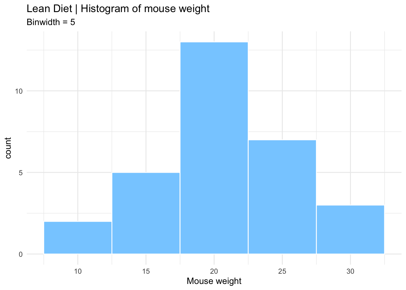
# Fat diet histogram
ggplot(fat, aes(x = weight)) +
  geom_histogram(
    binwidth = 1,
   color="white",
    fill="seagreen3"
  ) +
  labs(
    x = "Mouse weight",
    title = "Fat Diet | Histogram of mouse weight",
    subtitle = "Binwidth = 1"
  ) +
  theme_minimal() -> fat_histogram    # save the plot

# Print the plot
fat_histogram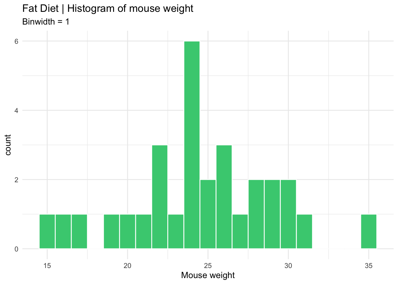
# Combine both histograms in the same plot using patchwork
  # Notice the different y axis scales
lean_histogram + fat_histogram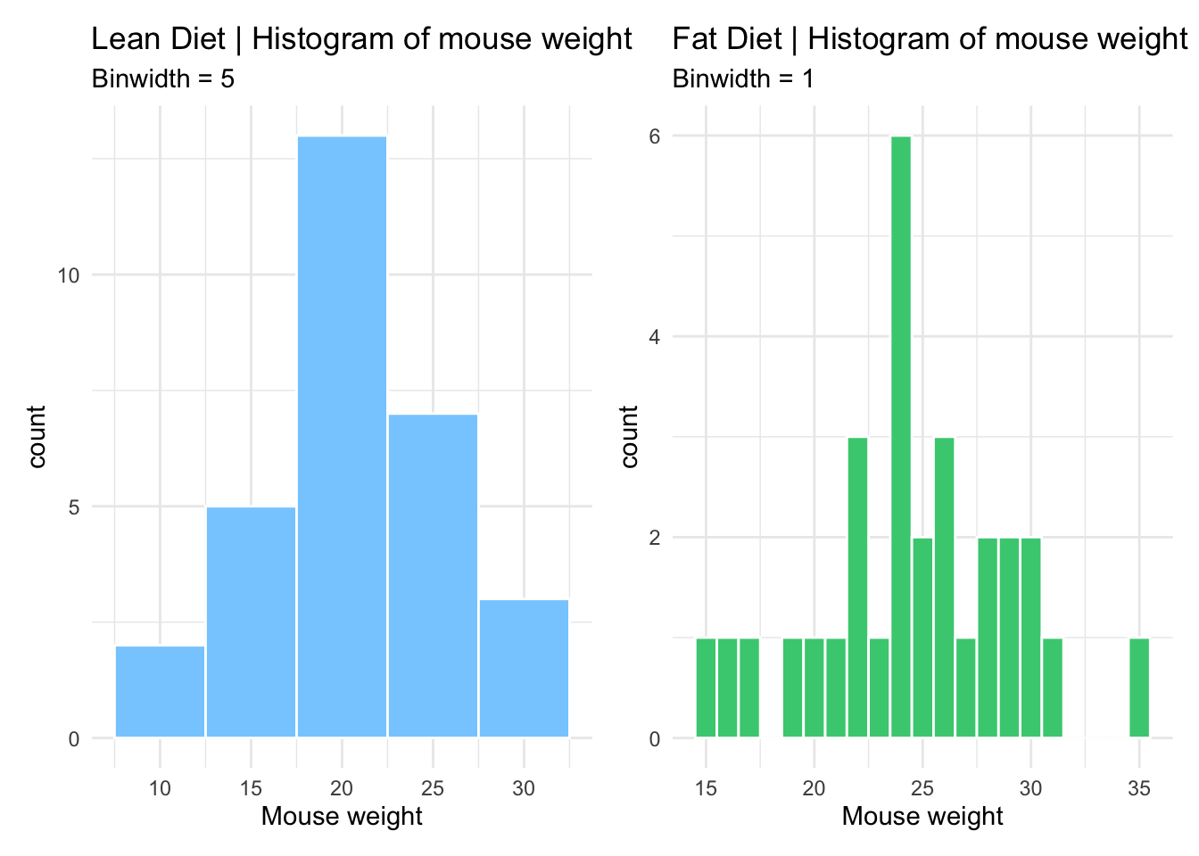
# Combine histograms with ggplot2 faceting
  # Axis scales can be formatted (the same or individual)
ggplot(mice_data, aes(x=weight, fill=diet)) +
  geom_histogram(binwidth=5, color="white") +
  facet_grid(~ diet)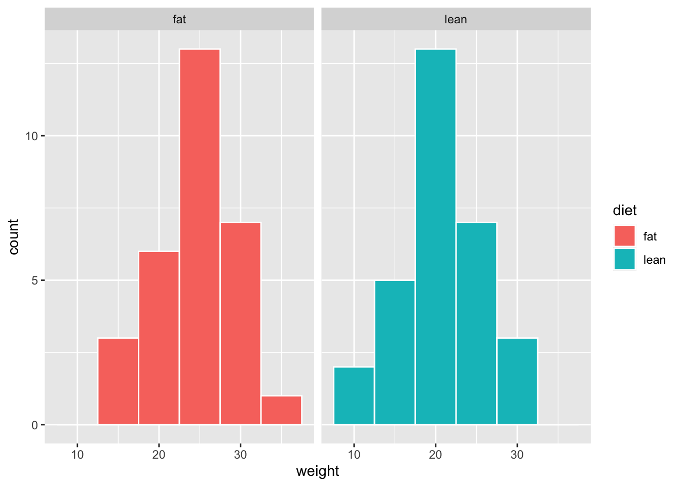
How is the variable “mouse weight” distributed in each diet? | Boxplots
Since our data of interest is one categorical variable (type of diet), and one continuous variable (weight), a boxplot is one of the most informative.
TipRecall Boxplots
A boxplot represents the distribution of a continuous variable. The box in the middle represents the interquartile range (IQR), which is the range of values from the first quartile to the third quartile, and the line inside the box represents the median value (i.e. the second quartile). The lines extending from the box are called whiskers, and represent the range of the data outside the box, i.e. the maximum and the minimum, excluding any outliers, which are shown as points outside the whiskers (not present in this dataset). Outliers are defined as values that are more than 1.5 times the IQR below the first quartile or above the third quartile.
# Box and whiskers plot - BASIC
ggplot(mice_data, aes(x=diet, y=weight)) +
  geom_boxplot()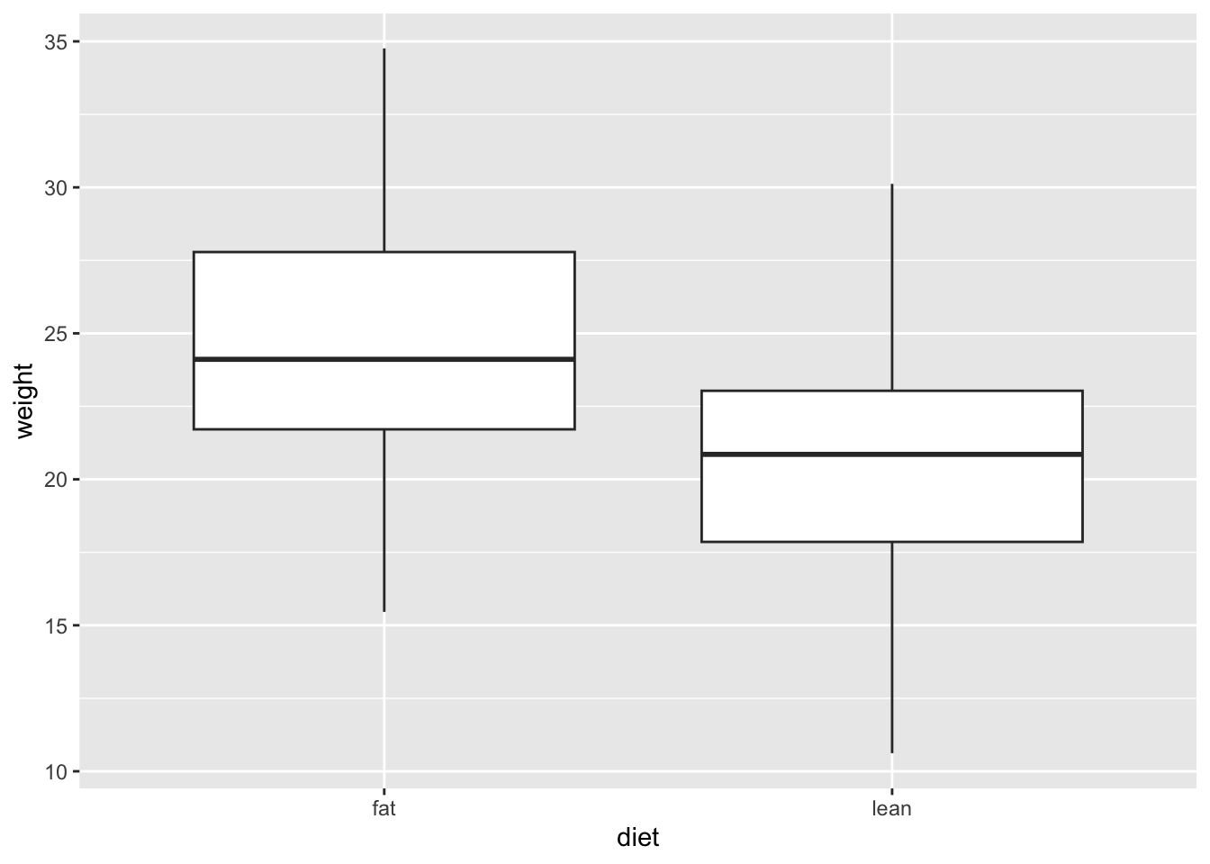
# Add color (from default ggplot palette)
ggplot(mice_data, aes(x=diet, y=weight)) +
  geom_boxplot(aes(fill=diet))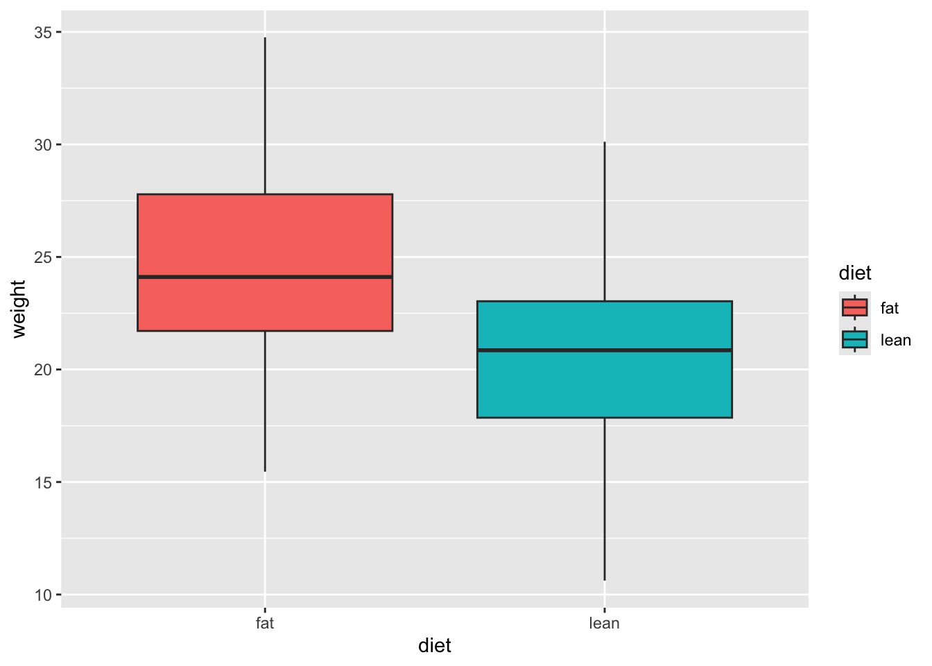
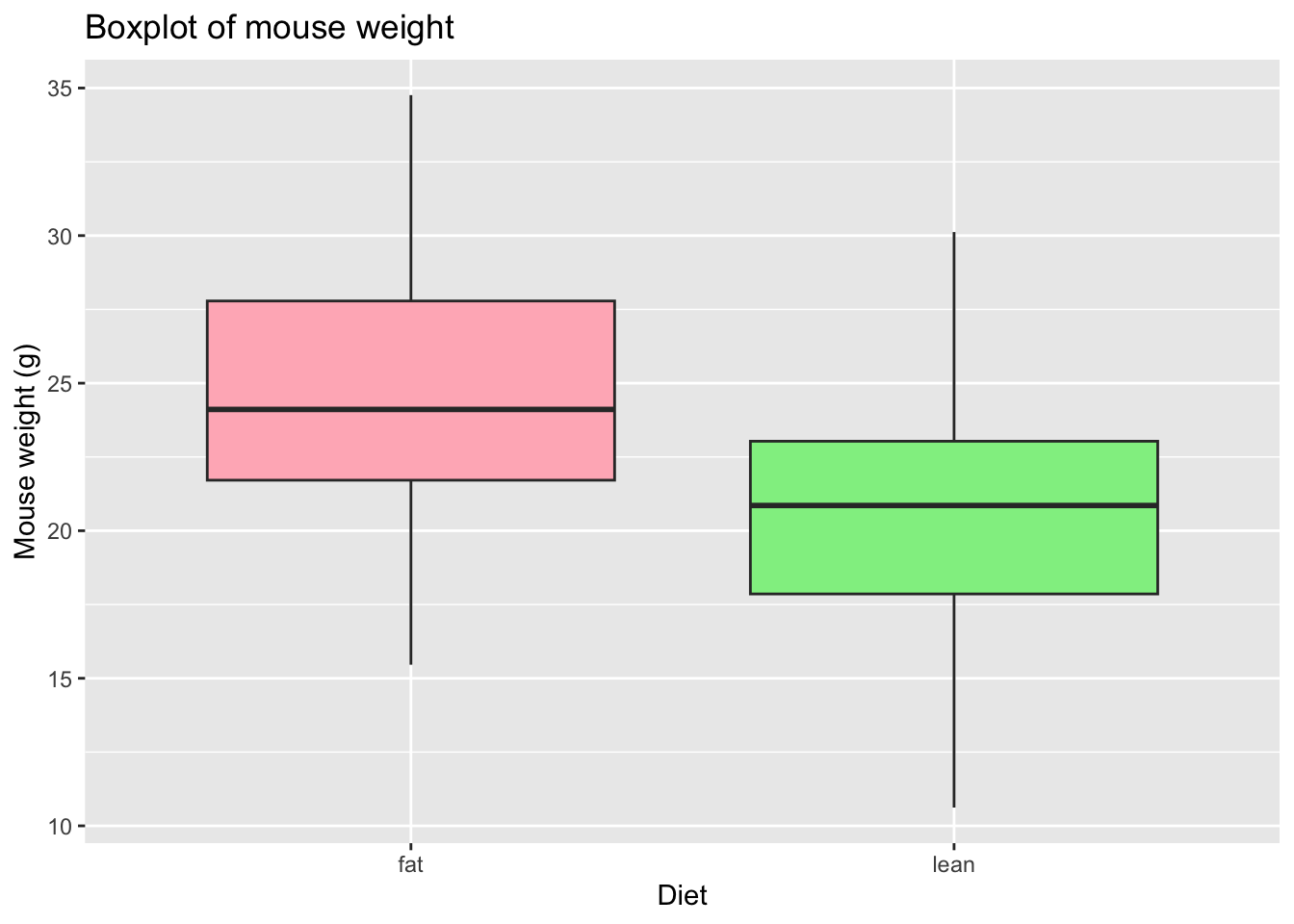
# Choose the colors, add X and Y axis names and the Title
    # Notice that the fill argument is not inside the aesthetics function
ggplot(mice_data, aes(x=diet, y=weight)) +
  geom_boxplot(fill=c("lightpink", "lightgreen")) +
  labs(x = "Diet",
       y = "Mouse weight (g)",
      title = "Boxplot of mouse weight"
    )
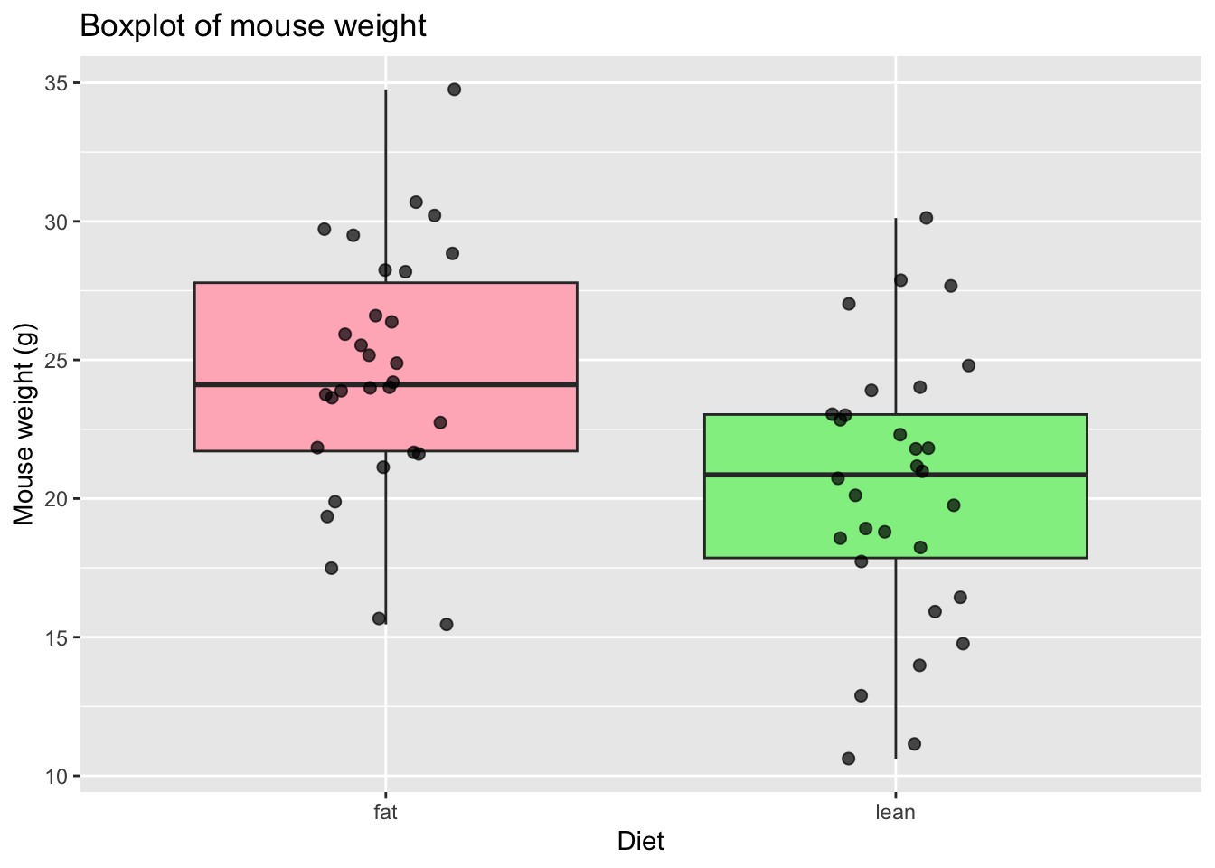
# Add points to the boxplot
ggplot(mice_data, aes(x = diet, y = weight)) +
  geom_boxplot(
    fill = c("lightpink", "lightgreen")
  ) +
  geom_jitter(
    width = 0.15,        # horizontal spread
    alpha = 0.7,         # transparency
    size = 2
  ) +
  labs(
    x = "Diet",
    y = "Mouse weight (g)",
    title = "Boxplot of mouse weight"
  )
How are the other variables distributed?
There are other variables in our data for each mouse that could influence the results, namely gender (categorical variable) and age (discrete variable). We should also look at these data.
TipRecall Barplots
A barplot represents the distribution of a categorical variable or the summary of a continuous variable across categories. Each bar corresponds to a category, and its height represents the value associated with that category, typically the count (frequency) or the proportion of observations.
When summarising a continuous variable, the height of the bar usually represents a summary statistic, such as the mean or the median, computed within each category.
The bars are separated by spaces to emphasise that the categories are discrete and do not have an intrinsic numerical continuity.
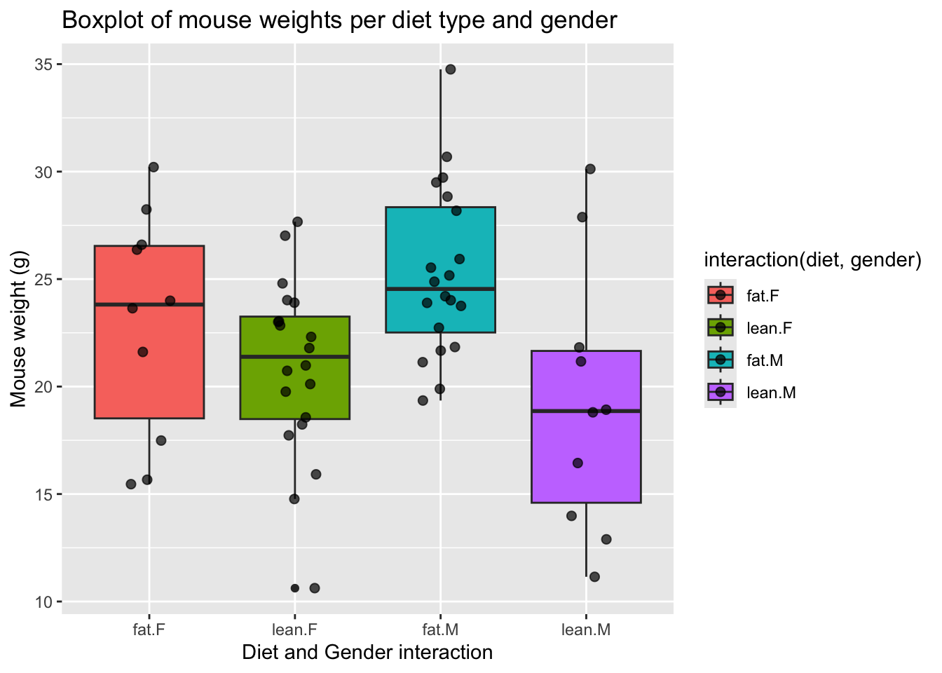
# Boxplot of diet and gender
ggplot(mice_data, aes(x=interaction(diet, gender), y=weight,
                      fill=interaction(diet, gender))) +
  geom_boxplot() +
  geom_jitter(
    width = 0.15,        # horizontal spread
    alpha = 0.7,         # transparency
    size = 2             # point size
  ) +
  labs(
    x = "Diet and Gender interaction",
    y = "Mouse weight (g)",
    title = "Boxplot of mouse weights per diet type and gender"
  )
# Barplot of mice age
ggplot(mice_data, aes(x=age_months)) +
  geom_bar(fill="mediumpurple1",
           color="white") +
  labs(
    x = "Mice age (months)",
    y = "Count",
    title = "Barplot of mice age"
  ) +
  theme_light()  # simple and light background for the plot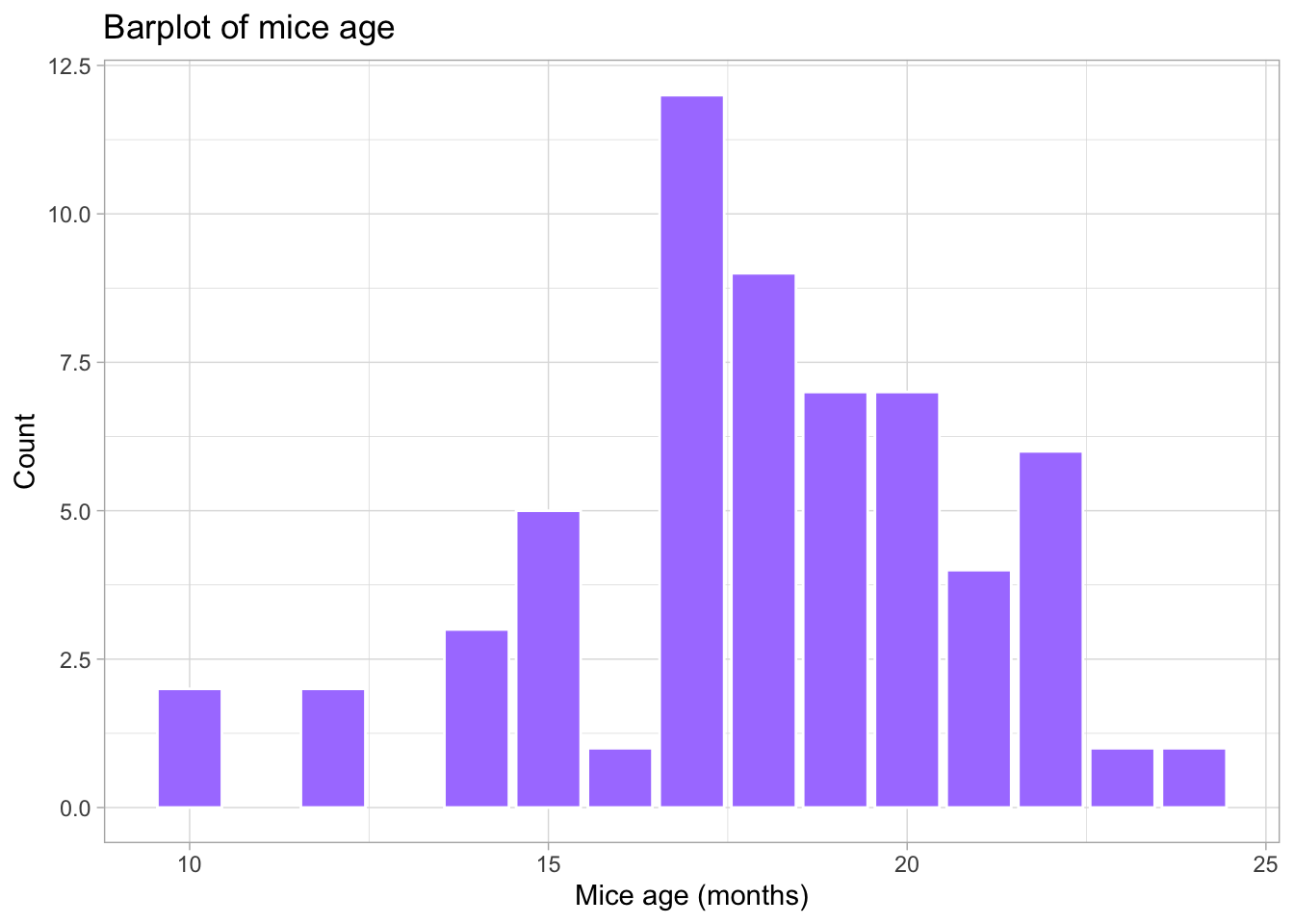
What is the frequency of each variable?
When exploring the results of an experiment, we want to learn about the variables measured (age, gender, weight), and how many observations we have for each variable (number of females, number of males …), or combination of variables, for example, number of females in lean diet. This is easily done by using the function table. This function outputs a frequency table, i.e. the frequency (counts) of all combinations of the variables of interest.
# How many measurements do we have for each gender (a categorical variable)
table(mice_data$gender)
 F  M
30 30
# How many measurements do we have for each diet (a categorical variable)
table(mice_data$diet)
 fat lean
  30   30
# How many measurements do we have for each gender in each diet?
# (Count the number of observations in the combination between
# the two categorical variables).
table(mice_data$diet, mice_data$gender)
        F  M
  fat  10 20
  lean 20 10
# We can also use this for numerical discrete variables, like age.
# How many measurements of each age (a discrete variable) do we have by gender?
table(mice_data$age_months, mice_data$gender)
     F M
  10 1 1
  12 0 2
  14 3 0
  15 3 2
  16 1 0
  17 7 5
  18 4 5
  19 4 3
  20 3 4
  21 1 3
  22 3 3
  23 0 1
  24 0 1
# And by diet type?
table(mice_data$age_months, mice_data$diet)
     fat lean
  10   0    2
  12   0    2
  14   2    1
  15   1    4
  16   0    1
  17   3    9
  18   6    3
  19   4    3
  20   6    1
  21   1    3
  22   5    1
  23   1    0
  24   1    0
# What if we want to know the results for each of the three variables:
# age, diet and gender? Using ftable instead of table to format the
# output in a more friendly way
ftable(mice_data$age_months, mice_data$diet, mice_data$gender) F M
10 fat 0 0
lean 1 1
12 fat 0 0
lean 0 2
14 fat 2 0
lean 1 0
15 fat 1 0
lean 2 2
16 fat 0 0
lean 1 0
17 fat 0 3
lean 7 2
18 fat 2 4
lean 2 1
19 fat 1 3
lean 3 0
20 fat 2 4
lean 1 0
21 fat 0 1
lean 1 2
22 fat 2 3
lean 1 0
23 fat 0 1
lean 0 0
24 fat 0 1
lean 0 0Bivariate Analysis | Linear regression and Correlation coefficient
Is there a dependency between the age and the weight of the mice in our study?
To test if two variables are correlated we will start by:
- Making a scatter plot of these two variables;
- Followed by a calculation of the Pearson correlation coefficient;
- Finally, fitting a linear model to the data to evaluate how the weight changes depending on the age of the mice.
# First step: scatter plot of age and weight
# Note that the dependent variable is the weight, so it should be in the y axis,
  # and the independent variable (age) should be in the x axis.
ggplot(mice_data, aes(x=age_months, y=weight)) +
  geom_point(shape=19, size=2)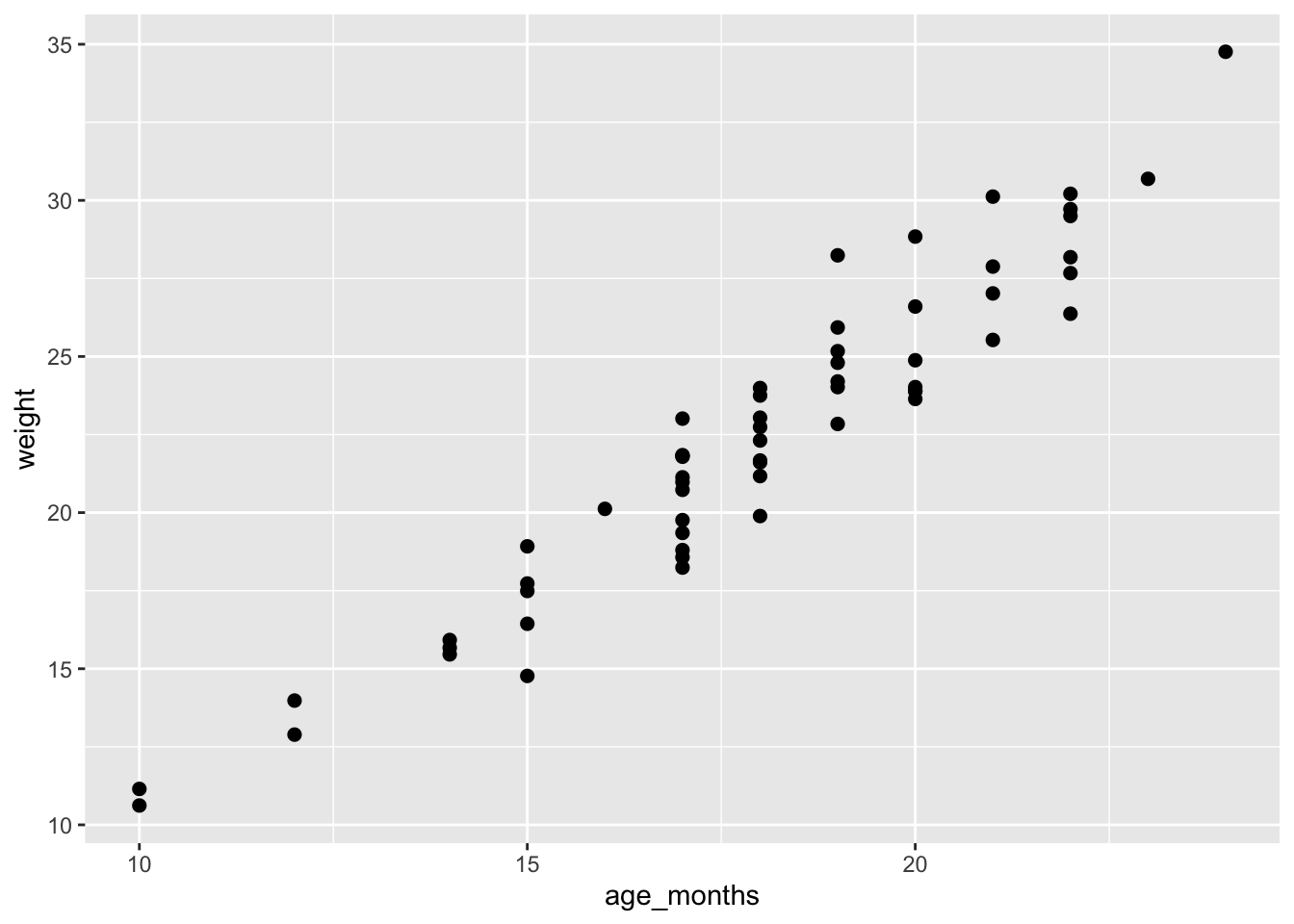
# Second step: Calculate the Pearson coefficient of correlation (r)
my.correlation <- cor(mice_data$weight,
mice_data$age_months,
method = "pearson")
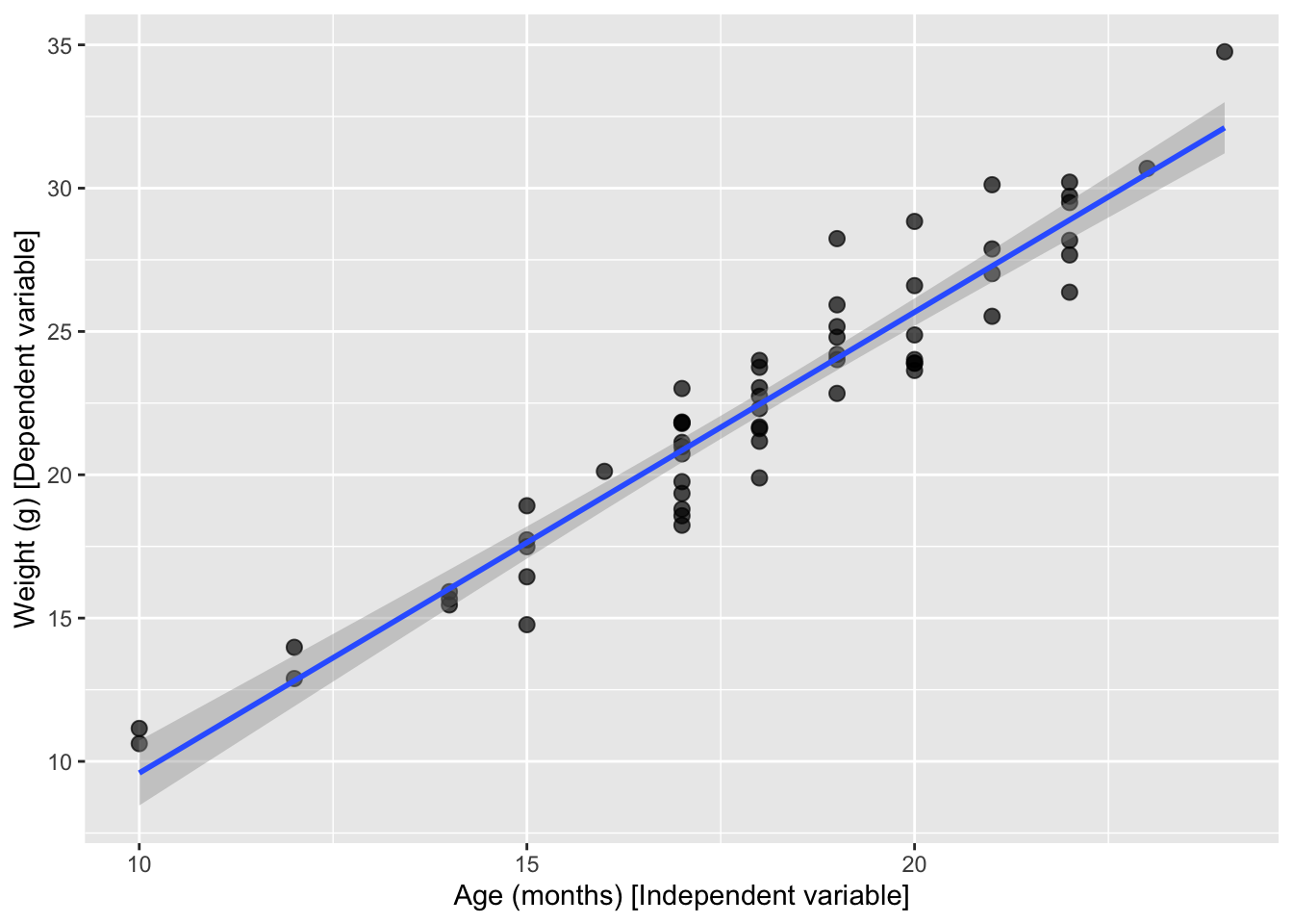
my.correlation[1] 0.9539404# Third step: fit a linear model (using the function lm) to check the coefficients overall
my.lm <- lm (weight ~ age_months, data=mice_data)
my.lm
Call:
lm(formula = weight ~ age_months, data = mice_data)

Coefficients:
(Intercept)   age_months
     -6.487        1.608
# Fit a line with confidence interval
ggplot(mice_data, aes(x = age_months, y = weight)) +
geom_point(shape = 19, size = 2.5, alpha = 0.7) +
geom_smooth(method = "lm", se = TRUE, formula = y ~ x) +
labs(
y = "Weight (g) [Dependent variable]",
x = "Age (months) [Independent variable]"
)
# Fit one line per diet type
# Just add a color grouping and ggplot fits one line per group
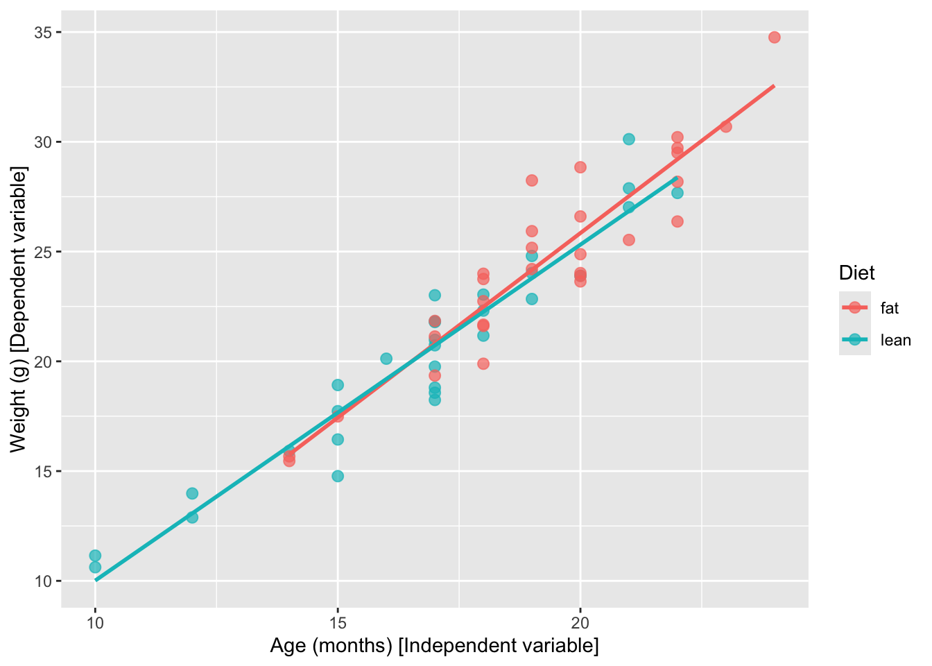
ggplot(mice_data, aes(x = age_months, y = weight, color = diet)) +
geom_point(shape = 19, size = 2.5, alpha = 0.7) +
geom_smooth(method = "lm", se = FALSE, formula = y ~ x) +
labs(
y = "Weight (g) [Dependent variable]",
x = "Age (months) [Independent variable]",
color = "Diet"
)
Hypothesis testing and Statistical significance using R
Going back to our original question: Does the type of diet influence the body weight of mice?
Can we answer this question just by looking at the plot? Are these observations compatible with a scenario where the type of diet does not influence body weight?
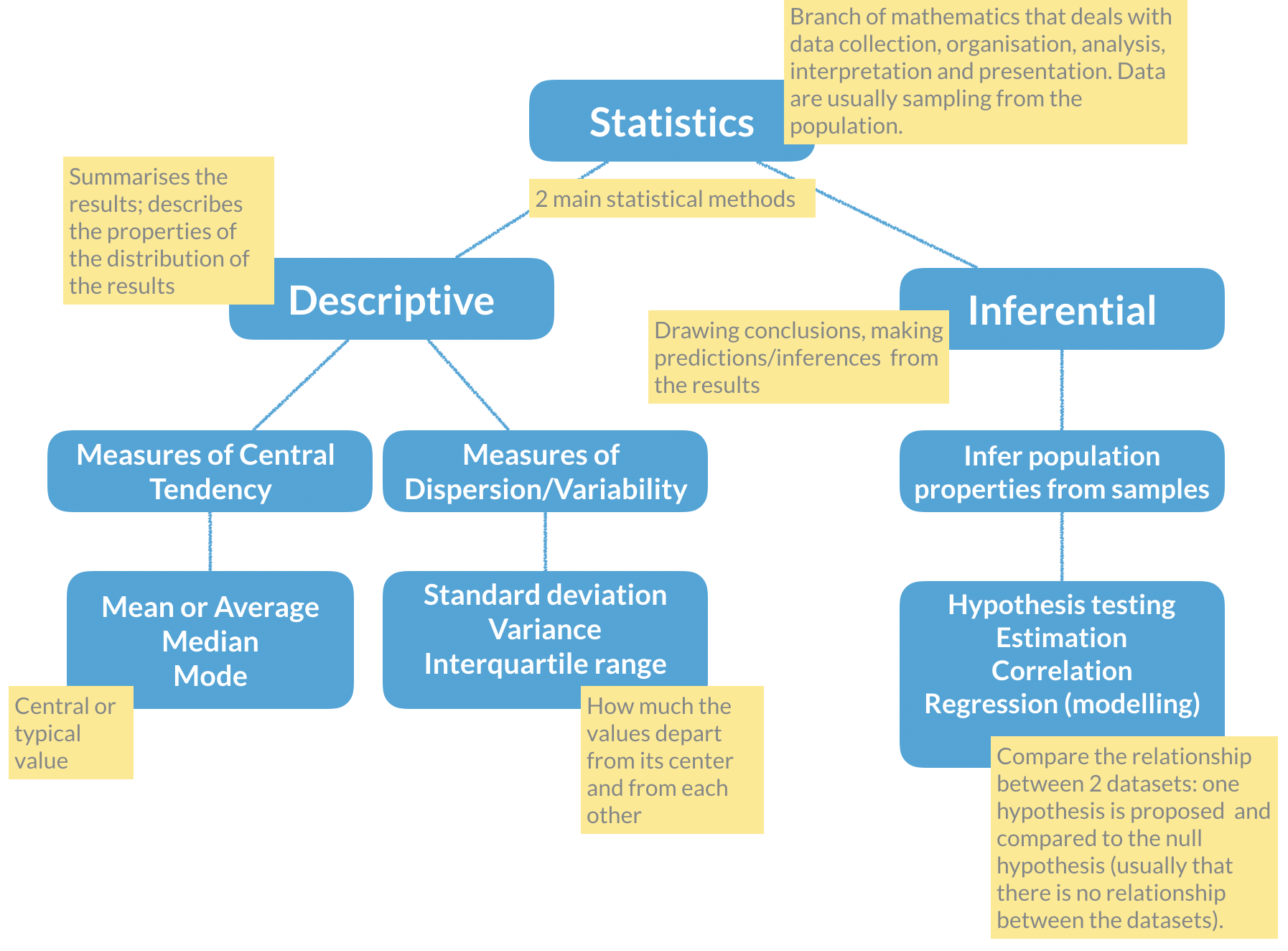
Remember the basic statistical methods:
Here enters hypothesis testing. In hypothesis testing, the investigator formulates a null hypothesis (H0) that usually states that there is no difference between the two groups, i.e. the observed weight differences between the two groups of mice occurred only due to sampling fluctuations (like when you repeat an experiment drawing samples from the same population). In other words, H0 corresponds to an absence of effect.
The alternative hypothesis (H1), just states that the effect is present between the two groups, i.e. that the samples were taken from different populations.
Hypothesis testing proceeds with using a statistical test to try and reject H0. For this experiment, we will use a T-test that compares the difference between the means of the two diet groups, yielding a p-value that we will use to decide if we reject the null hypothesis, at a 5% significance level (p-value < 0.05). Meaning that, if we repeat this experiment 100 times in different mice, in 5 of those experiments we will reject the null hypothesis, even thought the null hypothesis is true.
# Apply a T-test to the lean and fat diet weights

### Explanation of the arguments used ###
  # alternative="two.sided": two-sided because we want to test any difference
  # between the means, and not only weight gain or weight loss
  # (in which case it would be a one-sided test)

  # paired=FALSE: because we measured the weight in 2 different groups of mice
  # (never the same individual). If we measure a variable 2 times in the same
  # individual the data would be paired.

  # var.equal=TRUE: T-tests apply to equal variance data, so we assume it is
  # TRUE and ask R to estimate the variance (if we chose FALSE, then R uses
  # another similar method called Welch (or Satterthwaite) approximation)

ttest <- t.test(lean$weight, fat$weight,
                alternative="two.sided",
                paired = FALSE,
                var.equal = TRUE)

# Print the results
ttest
    Two Sample t-test

data:  lean$weight and fat$weight
t = -3.4197, df = 58, p-value = 0.001154
alternative hypothesis: true difference in means is not equal to 0
95 percent confidence interval:
 -6.550137 -1.713197
sample estimates:
mean of x mean of y
 20.36700  24.49867
Now that we have calculated the T-test, shall we accept or reject the null hypothesis? What are the outputs in R from the t-test?
# Find the names of the output from the function t.test
names(ttest)
[1] "statistic" "parameter" "p.value" "conf.int" "estimate"
[6] "null.value" "stderr" "alternative" "method" "data.name" # Extract just the p-value
ttest$p.value[1] 0.00115364Final discussion
Take some time to discuss the results with your classmates, and decide if H0 should be rejected or not, and how confident you are that your decision is reasonable. Can you propose solutions to improve your confidence on the results? Is the experimental design appropriate for the research question being asked? Is this experiment well controlled and balanced?
Self-evaluation exam
The first task for today is to complete an individual self-evaluating exam, where you will have one hour to answer some data analysis questions using R. This is not for performance evaluation, meaning that the correctness of your answers will not be evaluated, but your application, participation, helping your colleagues will be evaluated. It is mostly intended for you to identify your difficulties and consolidate knowledge.
- For this self-evaluation exam, the
ualg.compbiopackage must be installed (not needed if you are using the RStudio Server account):
# Make sure the `remotes` package is installed:
  # TRUE if installed, FALSE otherwise
"remotes" %in% rownames(installed.packages())

# If FALSE, uncomment this line to install the package:
# install.packages("remotes")

# Now you can install the `ualg.compbio` package from GitHub:
remotes::install_github("instructr/ualg.compbio")- Run the
self_eval_examfrom theualg.compbiopackage:
learnr::run_tutorial("self_eval_exam", package = "ualg.compbio")- Please complete the exam. You have 60 minutes.
Exploratory Data Analysis (EDA): A Stepwise Scientific Approach
Exploratory data analysis (EDA) is the first structured step in any data-driven project. Its purpose is not hypothesis testing, but understanding:
- What variables are available?
- What types of data do we have?
- Are there missing values?
- What are the main distributions and relationships?
- Are there obvious patterns or anomalies?
Step 1 | Define the biological question
Exploratory Data Analysis (EDA) begins with a biological question.
In this project, we analyse a simulated zebrafish dataset representing an experiment where animals from different strains were raised under controlled conditions. Some are wild-type (WT) controls, others are genetically modified (knock-out or overexpression of a gene of interest).
At the end of the study, several morphological traits were measured, along with biological sex and experimental year.
Before analysing the data, we ask:
- Do strains differ morphologically?
- Are there sex-based differences?
- Do traits scale proportionally with body size?
- Could genetic manipulation affect growth patterns?
EDA is not hypothesis testing, it is structured scientific observation.
Step 2 | Inspect the dataset structure
Start by:
- Creating a new folder for this mini-project inside the folder that you created for the computational biology classes;
- Create an Rproject inside this folder;
- Create an R script to save your mini-project data analysis (if you need help with these steps, recall the instructions in the
3. Practicing Rprotocol);
- Create an R script to save your mini-project data analysis (if you need help with these steps, recall the instructions in the
- Download the dataset here and save it in your
datafolder.
- Download the dataset here and save it in your
- Start the data analysis by loading the required packages and the dataset.
#Load required package
library(dplyr)
library(tidyr)
library(readr)
library(ggplot2)
library(patchwork)
library(GGally)
library(recipes)

# Reading and formatting the data
zebrafish <-
  readr::read_csv(file = "data/zebrafish.csv")
Now we inspect its structure.
# Look at the data (uncomment to view the table)
# View(zebrafish)

# Describe the data structure
glimpse(zebrafish)
Rows: 344
Columns: 8
$ strain <chr> "AB", "AB", "AB", "AB", "AB", "AB", "AB", "AB", "…
$ treatment <chr> "WT", "WT", "WT", "WT", "WT", "WT", "WT", "WT", "…
$ body_length_mm <dbl> 39.1, 39.5, 40.3, NA, 36.7, 39.3, 38.9, 39.2, 34.…
$ body_width_mm <dbl> 9.35, 8.70, 9.00, NA, 9.65, 10.30, 8.90, 9.80, 9.…
$ caudal_fin_length_mm <dbl> 6.033333, 6.200000, 6.500000, NA, 6.433333, 6.333…
$ body_mass_g <dbl> 3.750, 3.800, 3.250, NA, 3.450, 3.650, 3.625, 4.6…
$ sex <chr> "male", "female", "female", NA, "female", "male",…
$ year <dbl> 2018, 2018, 2018, 2018, 2018, 2018, 2018, 2018, 2…dim(zebrafish)[1] 344 8Here we determine:
- Number of observations (rows)
- Number of variables (columns)
- Variable types (numeric, factor, etc.)
- Presence of missing values
Understanding structure precedes interpretation.
Tiday Data: Concept, Structure & Semantics
Tidy data aligns the structure of a dataset with its meaning. It follows three key principles:
- Each variable is a column.
- Each observation is a row.
- Each value is a single cell.
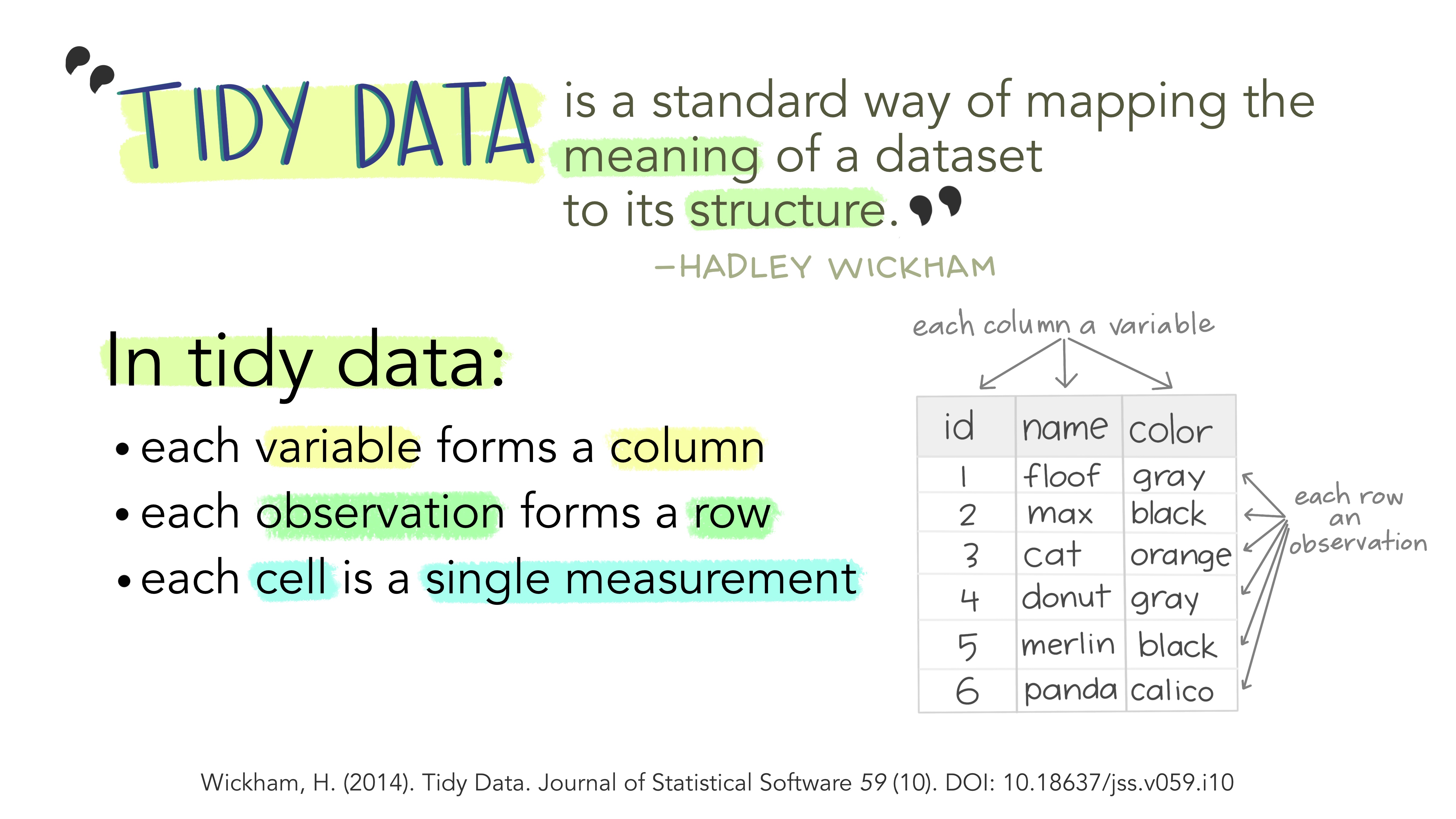
This structure makes analysis more efficient by ensuring that variables and observations are consistently represented.
Data consists of values that belong to:
- Variables: Attributes measured across units (e.g., height, score).
- Observations: Measurements for a single unit (e.g., a person, a test result).
Different structures can represent the same data. For instance, wide and long formats can hold identical information but differ in layout. A tidy format ensures that each row represents a distinct observation, making relationships between values explicit.
Illustrations from the Openscapes blog: Tidy Data for reproducibility, efficiency, and collaboration by Julia Lowndes and Allison Horst (https://openscapes.org/blog/2020-10-12-tidy-data/)
Step 3 | Assess data quality and prepare the dataset
Missing data can affect summary statistics and models. We quantify how much “missingness” exists in each variable.
zebrafish |>
  summarise(across(everything(), \(x) sum(is.na(x))))
# A tibble: 1 × 8
strain treatment body_length_mm body_width_mm caudal_fin_length_mm body_mass_g
<int> <int> <int> <int> <int> <int>
1 0 0 2 2 2 2
# ℹ 2 more variables: sex <int>, year <int>This gives the number of missing values per variable.
In real analyses, we would decide whether to:
- Remove incomplete rows,
- Impute missing values,
- Or model missingness explicitly.
We remove incomplete cases for this exploratory exercise:
zebrafish_clean <-
  zebrafish |>
  drop_na() |>
  # transform the character variables into factors
  # to facilitate data modelling and visualization
  mutate(strain = as.factor(strain),
         treatment = as.factor(treatment),
         sex = as.factor(sex))
EDA always includes verification of data integrity.
Step 4 | Explore one variable at a time (univariate analysis)
Step 4 | Explore one variable at a time (univariate analysis)
Understanding distributions is fundamental in exploratory data analysis. Before comparing groups or studying relationships between variables, we must first understand how each variable behaves on its own.
TipRecall Continuous variables
Continuous variables (numerical measurements such as body length, body width, caudal fin length, or body mass) can take a wide range of values. For these variables we want to understand:
- where most observations are located (central tendency), and
- how spread out the values are (dispersion).
Useful plots for continuous variables include:
- Histograms, which show the frequency of values across intervals
- Density plots, which show the overall shape of the distribution
- Boxplots, which summarise the median, interquartile range, and potential outliers
TipRecall Categorical variables
Categorical variables (such as strain, treatment, or sex) represent groups or categories rather than numerical measurements. For these variables we want to know how many observations fall into each category.
Popular plots for categorical variables include:
- Barplots, which show the number of observations per category
To begin this step, we will examine the distribution of each variable individually, together with their summary statistics. For numerical variables, we will look at measures of central tendency (such as the mean and median) and dispersion (such as the range and quartiles). For categorical variables, we will examine the levels (categories) present in the dataset — in this case strain, treatment, and sex — and count how many individuals belong to each group.
summary(zebrafish_clean) strain treatment body_length_mm body_width_mm caudal_fin_length_mm
AB:146 KO:163 Min. :32.10 Min. : 6.550 Min. :5.733
TL: 68 OE:123 1st Qu.:39.50 1st Qu.: 7.800 1st Qu.:6.333
TU:119 WT: 47 Median :44.50 Median : 8.650 Median :6.567
Mean :43.99 Mean : 8.582 Mean :6.699
3rd Qu.:48.60 3rd Qu.: 9.350 3rd Qu.:7.100
Max. :59.60 Max. :10.750 Max. :7.700
body_mass_g sex year
Min. :2.700 female:165 Min. :2018
1st Qu.:3.550 male :168 1st Qu.:2018
Median :4.050 Median :2019
Mean :4.207 Mean :2019
3rd Qu.:4.775 3rd Qu.:2020
Max. :6.300 Max. :2020 This provides a compact overview of scale and variability.
However, visualizing the distributions of these variables is very common and, often, most insightful than just looking at a table with values.
The visualizations used depend not only on the data type (numerical vs categorical for example), but also on the biological questions that we want to ask the data.
A first useful question to ask the data is: how many individuals belong to each strain?
Since strain is a categorical variable, we examine how body mass differs between groups.
# Using dplyr style code
zebrafish_clean |>
  count(strain, sex, treatment)
# A tibble: 10 × 4
strain sex treatment n
<fct> <fct> <fct> <int>
1 AB female KO 22
2 AB female OE 27
3 AB female WT 24
4 AB male KO 22
5 AB male OE 28
6 AB male WT 23
7 TL female OE 34
8 TL male OE 34
9 TU female KO 58
10 TU male KO 61# Or using r base ftable function
ftable(zebrafish_clean$strain,
zebrafish_clean$sex,
zebrafish_clean$treatment) KO OE WT
AB female 22 27 24
male 22 28 23
TL female 0 34 0
male 0 34 0
TU female 58 0 0
male 61 0 0And visually:
ggplot(zebrafish_clean, aes(x = strain, fill = strain)) +
  geom_bar() +
  labs(
    title = "Number of individuals per strain",
    x = "Strain",
    y = "Count"
  )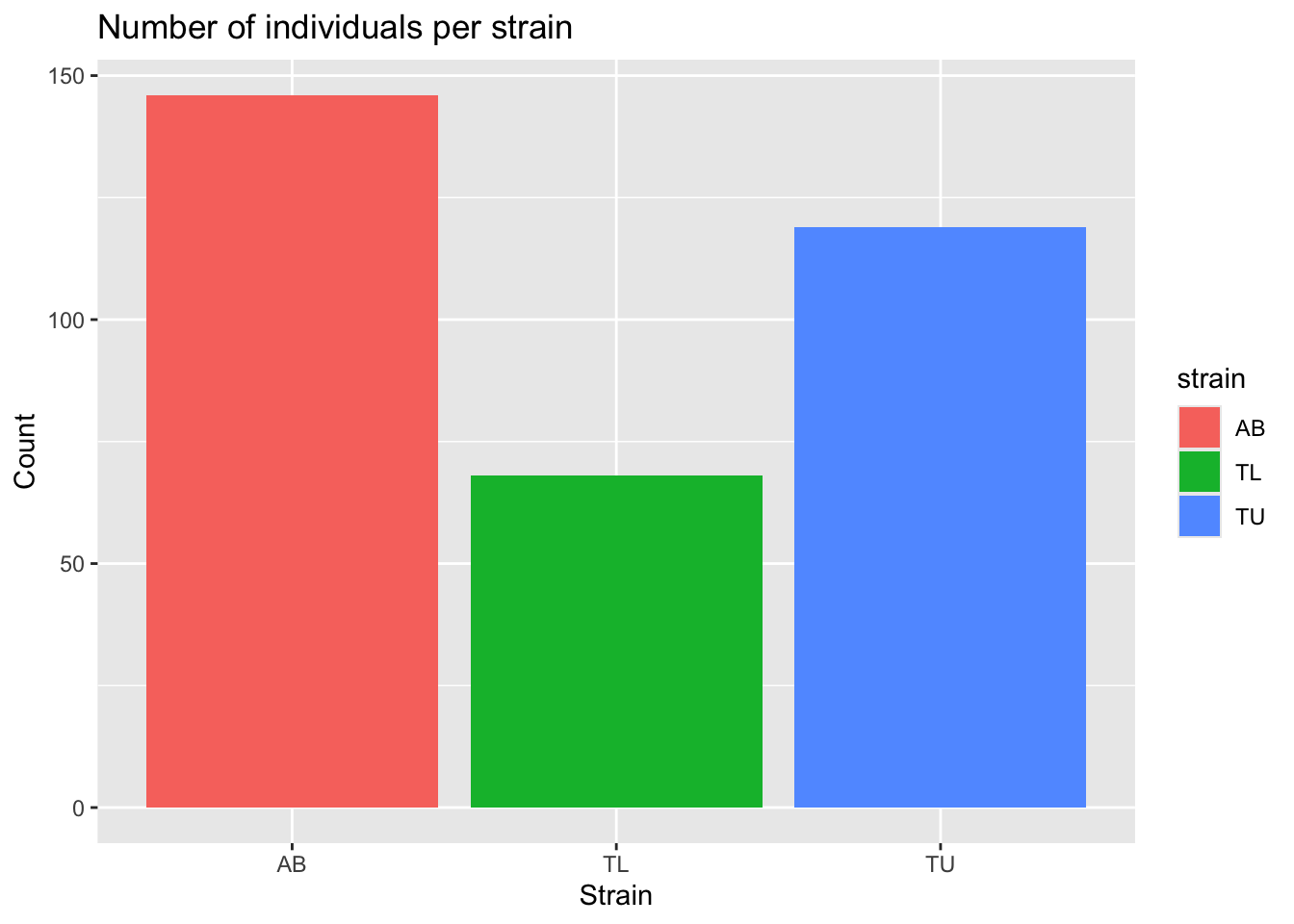
This helps us detect imbalance between groups, which may influence modelling later.
Another relevant question is about the body mass distribution.
Since body mass is a numeric variable, we will look at the histogram of body mass.
We can then color it by some other categorical variable. In this case, we will group and color the histogram per strain.
mass_hist <- ggplot(
  data = zebrafish_clean,
  aes(x = body_mass_g)
) +
  geom_histogram(
    aes(fill = strain),
    alpha = 0.5,
    position = "identity",
    bins = 30
  ) +
  scale_fill_manual(values = c("tan", "steelblue1", "violetred")) +
  labs(
    x = "Body mass (g)",
    y = "Frequency",
    title = "Body mass distribution"
  )

mass_hist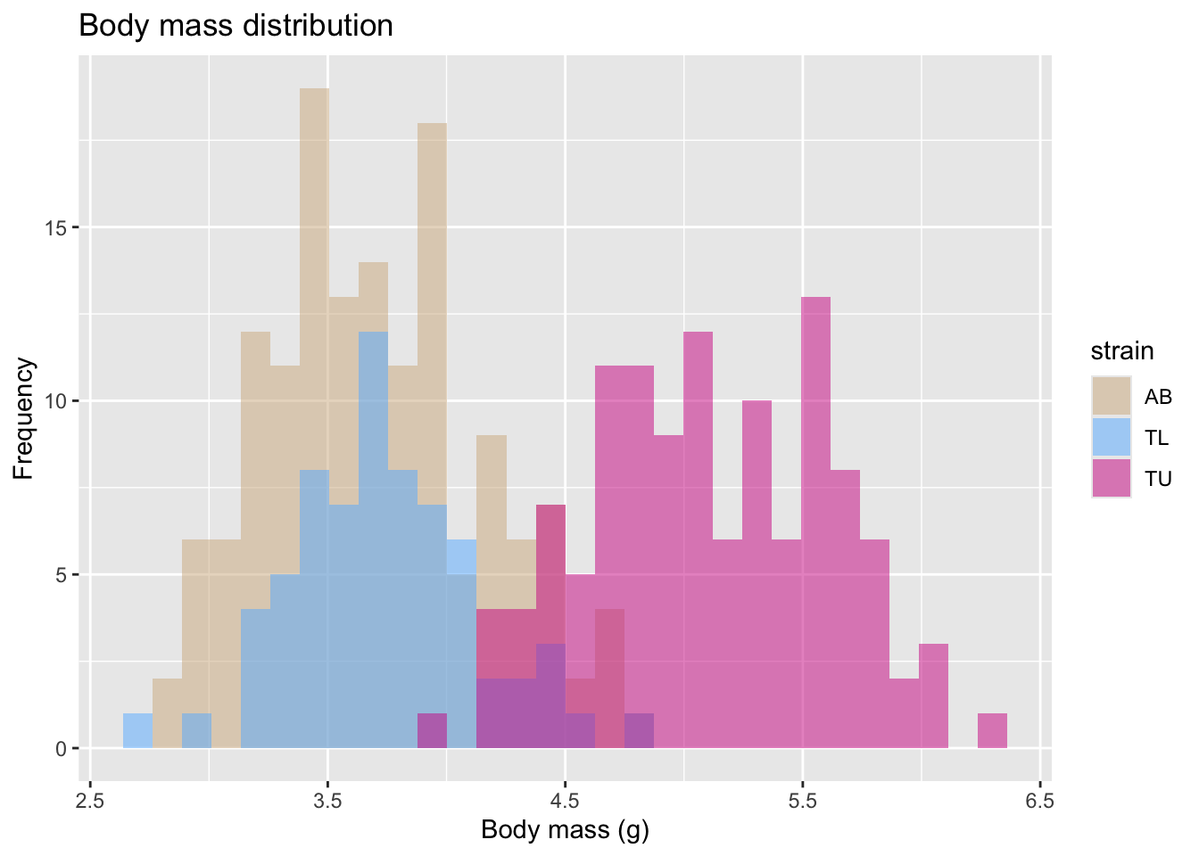
Another way to visualize this distribution, is a boxplot, also colored (and grouped) by zebrafish strain.
ggplot(zebrafish_clean, aes(x = strain, y = body_mass_g, fill = strain)) +
  geom_boxplot() +
  labs(
    title = "Body mass by strain",
    x = "Strain",
    y = "Body mass (g)"
  )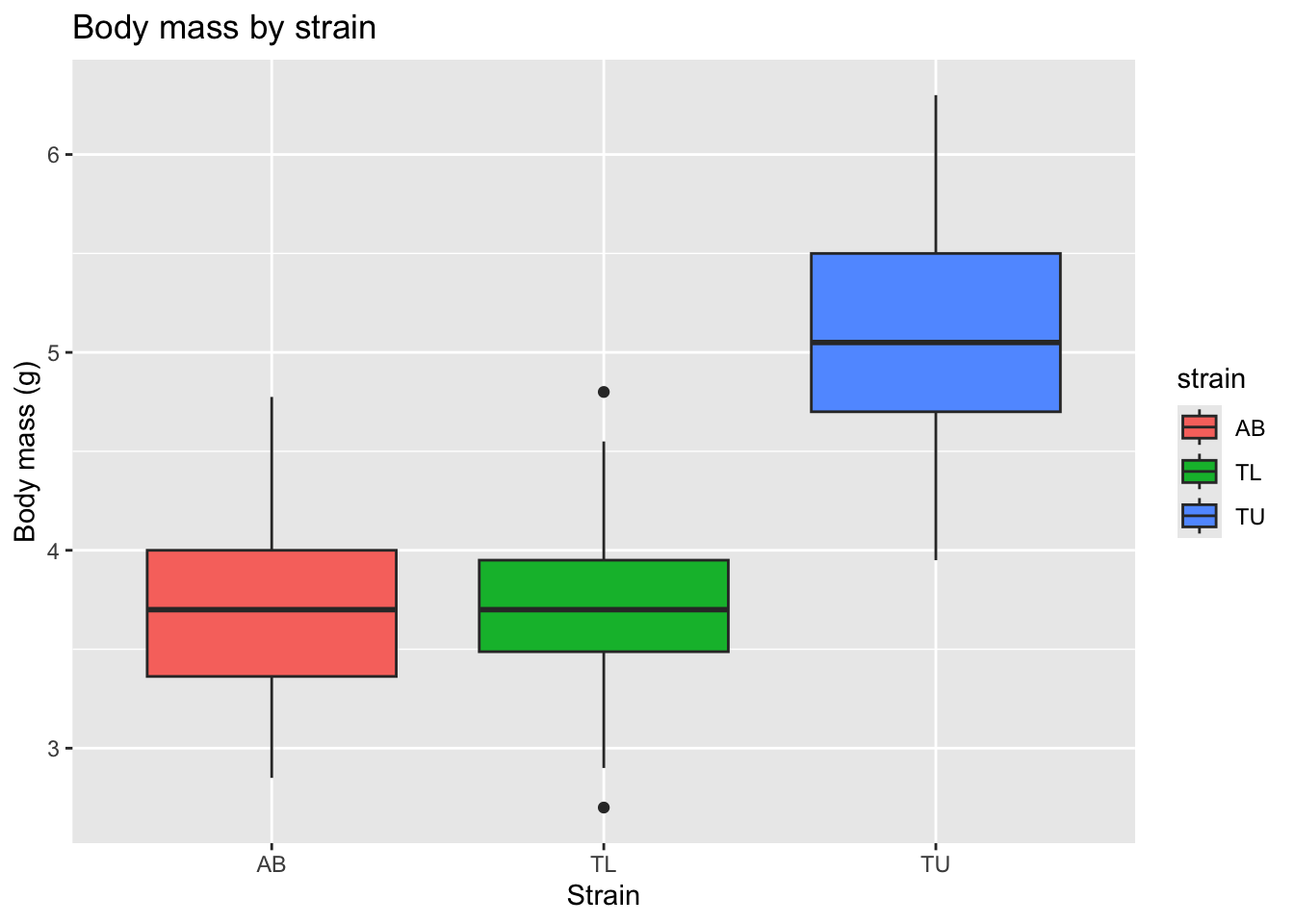
This allows us to compare medians, variability, and potential outliers across strains.
However, in many biomedical datasets, sex-based differences are substantial and biologically meaningful. So, we should also explore whether body mass differs by zebrafish sex.
ggplot(zebrafish_clean, aes(x = sex, y = body_mass_g, fill = sex)) +
  geom_boxplot() +
  labs(
    title = "Body mass by sex",
    x = "Sex",
    y = "Body mass (g)"
  )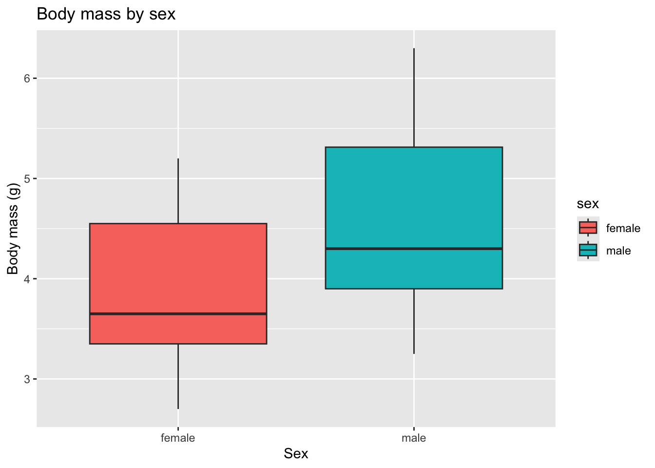
This shows that zebrafish females tend to have lower body weight than males overall.
How does the size of the fin change with strain and sex?
Let’s look at the caudal fin length histogram, colored by strain.
fin_hist <- ggplot(
  data = zebrafish_clean,
  aes(x = caudal_fin_length_mm)
) +
  geom_histogram(
    aes(fill = strain),
    alpha = 0.5,
    position = "identity",
    bins = 30
  ) +
  scale_fill_manual(values = c("cyan3", "orchid", "yellow3")) +
  labs(
    x = "Caudal fin length (mm)",
    y = "Frequency",
    title = "Caudal fin length distribution"
  )

fin_hist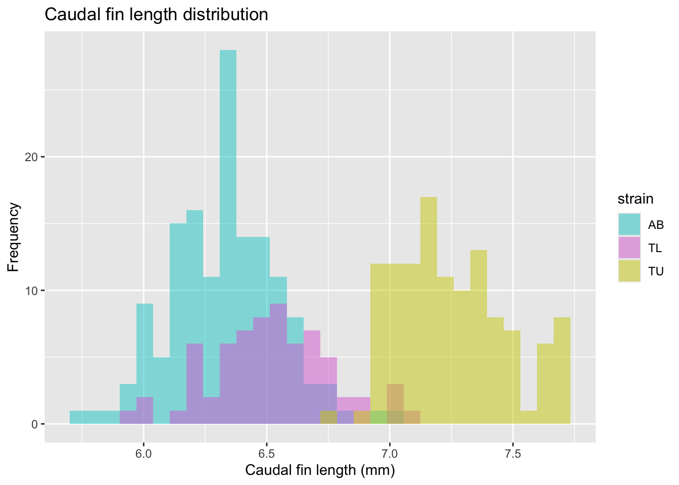
Or looking at the caudal fin length boxplots, per strain, but showing all the individual datapoints to make the plot more intuitive.
fin_box <- ggplot(
  data = zebrafish_clean,
  aes(x = strain,
      y = caudal_fin_length_mm)
) +
  geom_boxplot(
    aes(color = strain),
    width = 0.3,
    show.legend = FALSE
  ) +
  geom_jitter(
    aes(color = strain),
    alpha = 0.5,
    show.legend = FALSE,
    position = position_jitter(width = 0.2, seed = 0)
  ) +
  scale_color_manual(values = c("cyan4", "purple", "darkorange")) +
  labs(
    x = "Strain",
    y = "Caudal fin length (mm)"
  )

fin_box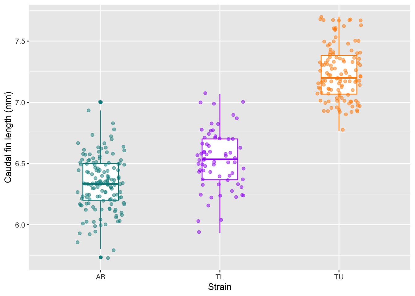
At this stage we should ask: Do strains appear different? Are distributions symmetric? Are there clear outliers? Can the caudal fin length be used as a classifier for zebrafish strains? Why?
Step 5 | Compare groups
Group comparisons refine our biological questions.
We can start to compare groups of samples by looking at the values from a correlation matrix. So we compute a simple correlation matrix for numeric variables.
TipMore about correlation
Correlation helps us detect:
- Redundancy between variables
- Strong linear associations
- Potential multicollinearity (useful for future modelling)
zebrafish_clean |>
  select(where(is.numeric)) |>
  cor()
body_length_mm body_width_mm caudal_fin_length_mm
body_length_mm 1.0000000 -0.2286256 0.6530956
body_width_mm -0.2286256 1.0000000 -0.5777917
caudal_fin_length_mm 0.6530956 -0.5777917 1.0000000
body_mass_g 0.5894511 -0.4720157 0.8729789
year 0.0326569 -0.0481816 0.1510679
body_mass_g year
body_length_mm 0.58945111 0.03265690
body_width_mm -0.47201566 -0.04818160
caudal_fin_length_mm 0.87297890 0.15106792
body_mass_g 1.00000000 0.02186213
year 0.02186213 1.00000000We should then examine relationships between variables.
Let’s start by looking at two continuous variables: body length and body width, colored per individual strains, using a scatterplot.
TipMore about scatterplots
A scatterplot helps detect:
- Linear or non-linear relationships
- Clustering by strain
- Separation between groups
ggplot(
  data = zebrafish_clean,
  aes(x = body_length_mm,
      y = body_width_mm)
) +
  geom_point(aes(color = strain),
             alpha = 0.7, size = 2) +
  labs(
    title = "Body dimensions | Colored by strain",
    x = "Body length (mm)",
    y = "Body width (mm)"
  )
This visualization already suggests that strains differ morphologically. But lets fit a linear model to each strain to check if the effect is real.
ggplot(
  data = zebrafish_clean,
  aes(x = body_length_mm,
      y = body_width_mm,
      group = strain)
) +
  geom_point(
    aes(color = strain),
    alpha = 0.7, size = 2) +
  geom_smooth(
    method = "lm",
    formula = y ~ x,
    se = FALSE,
    aes(color = strain)
  ) +
  labs(
    title = "Body dimensions | Linear model per strain",
    x = "Body length (mm)",
    y = "Body width (mm)",
    color = "Strain"
  ) +
  theme(
    legend.position = c(0.85, 0.15),
    plot.title.position = "plot"
  )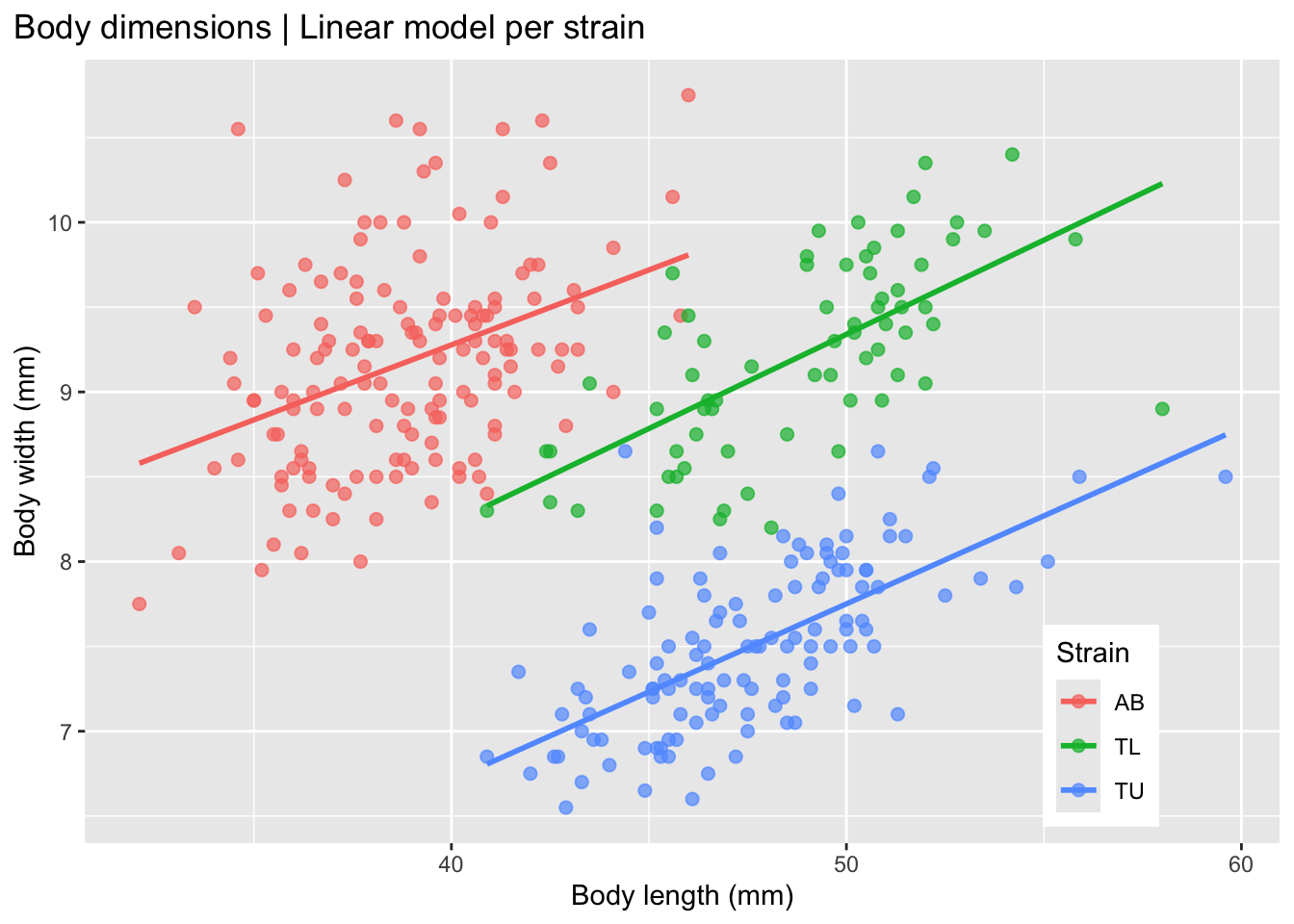
This plot shows that the strains seem to differ morphologically, with a positive correlation between body length and body width in each of the three strains.
So, what do we expect to find when we fit a linear model to the non-stratified data, i.e. not separated by strain? Let’s evaluate this plot.
ggplot(
  data = zebrafish_clean,
  aes(x = body_length_mm,
      y = body_width_mm)
) +
  geom_point(alpha = 0.7, size = 2) +
  geom_smooth(
    method = "lm",
    formula = y ~ x,
    se = FALSE,
    color = "gray50"
  ) +
  labs(
    title = "Body dimensions | Linear model for aggregated data",
    x = "Body length (mm)",
    y = "Body width (mm)"
  ) +
  theme(plot.title.position = "plot")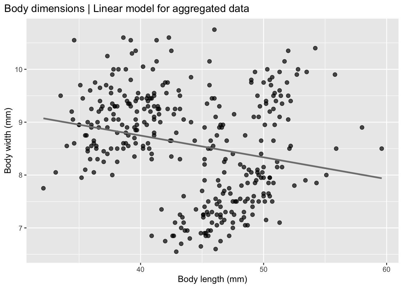
Now it seems that, for the whole group there is a negative correlation in zebrafish between body length and body width, when the data is pooled together, which is the opposite of what we see in the individual strain data.
This is called Simpson’s paradox which is a statistical phenomenon in which a trend observed in separate groups reverses or disappears when the groups are combined. In other words, a relationship between two variables may appear positive (or negative) within each subgroup, but when all data are pooled together, the overall relationship shows the opposite pattern.
The Simpson’s paradox reveals that pooled data can mislead interpretation, highlighting the importance of proper experimental design and data stratification.
TipMore about Simpson’s paradox
The Simpson’s paradox occurs because a third variable (often called a confounder) influences both the grouping structure and the outcome. When that variable is ignored, the aggregated data can give a misleading conclusion.
A classic example is treatment effectiveness: a treatment may appear beneficial within both males and females separately, yet appear harmful when the sexes are combined, simply because the distribution of males and females differs across treatment groups.
Simpson’s paradox highlights the importance of stratification, careful experimental design, and understanding the data-generating process before interpreting aggregated results.
Is there a relationship between weight and caudal fin size?
Here we will look at data per strain (color) and sex (shape).
mass_fin <- ggplot(
  data = zebrafish_clean,
  aes(x = caudal_fin_length_mm,
      y = body_mass_g)
) +
  geom_point(
    aes(color = strain,
        shape = sex),
    size = 3,
    alpha = 0.8
  ) +
  scale_color_manual(values = c("skyblue1", "coral", "seagreen3")) +
  labs(
    title = "Caudal fin length and body mass | Per strain and Sex",
    x = "Caudal fin length (mm)",
    y = "Body mass (g)",
    color = "Strain",
    shape = "Sex"
  ) +
  theme(
    legend.position = c(0.2, 0.7),
    plot.title.position = "plot"
  )

mass_fin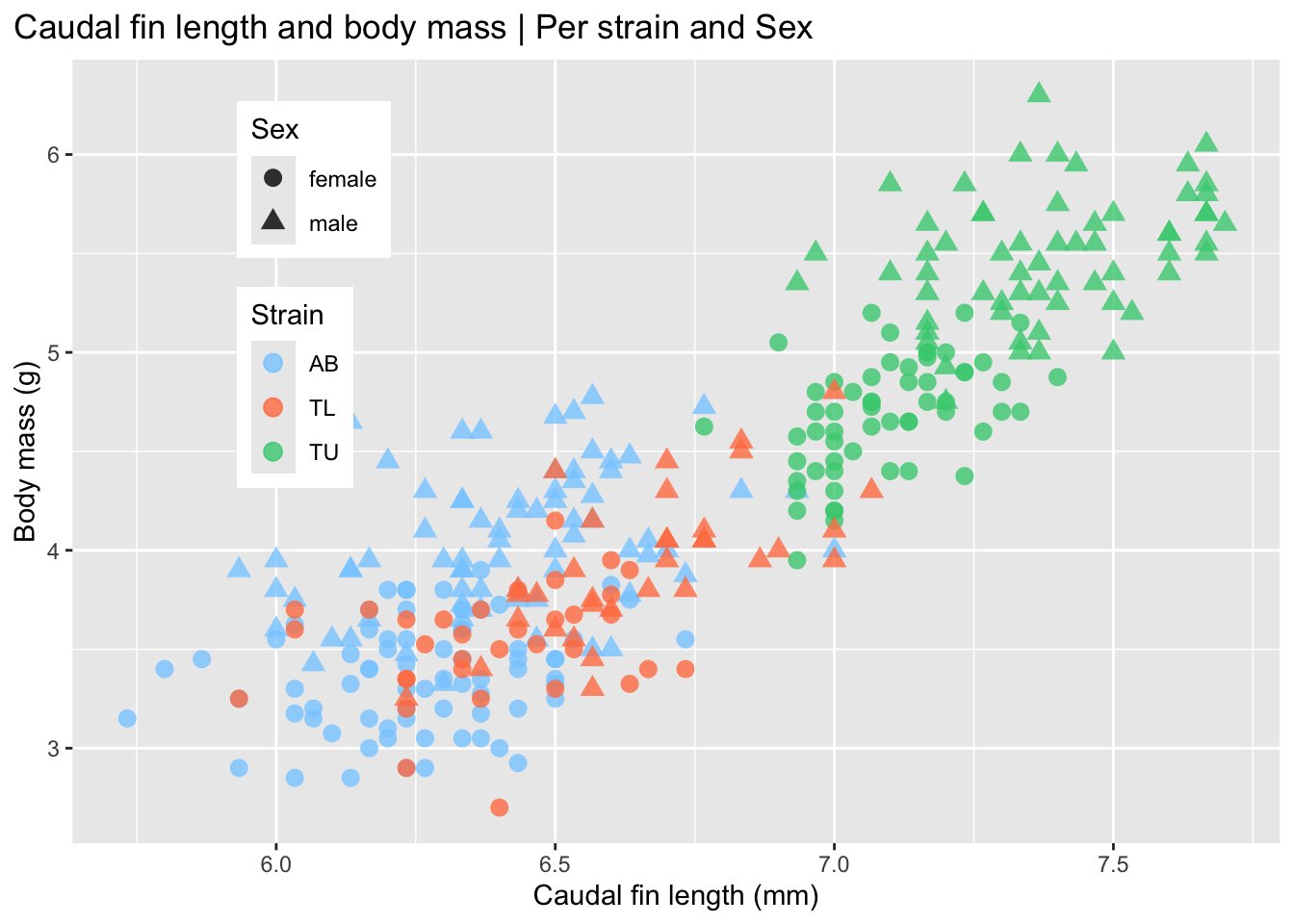
This plot shows that the caudal fin length only correlates with weight in the TU strain, while it appears similar between the AB and TL strains.
Is there a relationship between caudal fin length and body length?
Here, again, we will look at data per strain (color) and sex(shape).
fin_length <- ggplot(
  data = zebrafish_clean,
  aes(x = caudal_fin_length_mm,
      y = body_length_mm)
) +
  geom_point(
    aes(color = strain,
        shape = sex),
    size = 3,
    alpha = 0.8
  ) +
  scale_color_manual(values = c("darkorange", "limegreen", "purple")) +
  labs(
    title = "Caudal fin and body length | Per strain",
    x = "Caudal fin length (mm)",
    y = "Body length (mm)",
    color = "Strain",
    shape = "Sex"
  ) +
  theme(
    legend.position = c(0.85, 0.15),
    plot.title.position = "plot"
  )

fin_length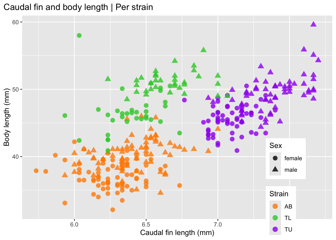
These plots are not simple to interpret. An alternative is to facet the plots. Let’s see how these plots look when the points are colored by sex and faceted by strain.
Facet by strain, color by sex
ggplot(
  zebrafish_clean,
  aes(x = caudal_fin_length_mm,
      y = body_length_mm)
) +
  geom_point(aes(color = sex)) +
  scale_color_manual(
    values = c("plum", "sandybrown"),
    na.translate = FALSE
  ) +
  labs(
    title = "Caudal fin length and body length",
    subtitle = "Male and female zebrafish by strain",
    x = "Caudal fin length (mm)",
    y = "Body length (mm)",
    color = "Sex"
  ) +
  theme(
    legend.position = "bottom",
    plot.title.position = "plot"
  ) +
  facet_wrap(~ strain)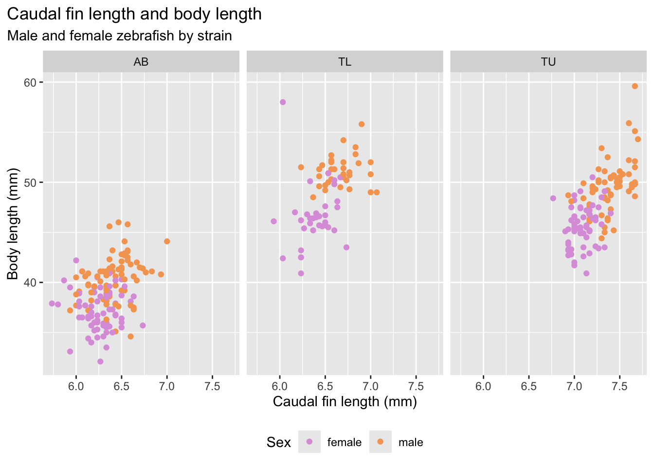
Step 7 | Explore multiple variables at once
Matrix of plots
GGally::ggpairs() creates a matrix of plots that shows relationships between multiple variables at once. It works with both numeric (quantitative) and categorical (discrete) variables.
NoteMore about ggpairs plot
The GGally::ggpairs() plot, by default, chooses the following organization:
Two numeric variables
- Lower triangle: scatterplots
- Upper triangle: correlation coefficients (overall and by group)
One numeric and one categorical variable
- Lower triangle: coloured histograms
- Upper triangle: boxplots
Two categorical variables
- Stacked bar charts
In short, ggpairs() automatically chooses sensible plot types depending on the type of variables being compared, making it useful for quick exploratory data analysis.
GGally::ggpairs(zebrafish_clean,
                mapping = aes(color = strain),
        columns = c("body_length_mm", "body_width_mm",
                    "caudal_fin_length_mm", "body_mass_g",
                    "treatment", "sex"))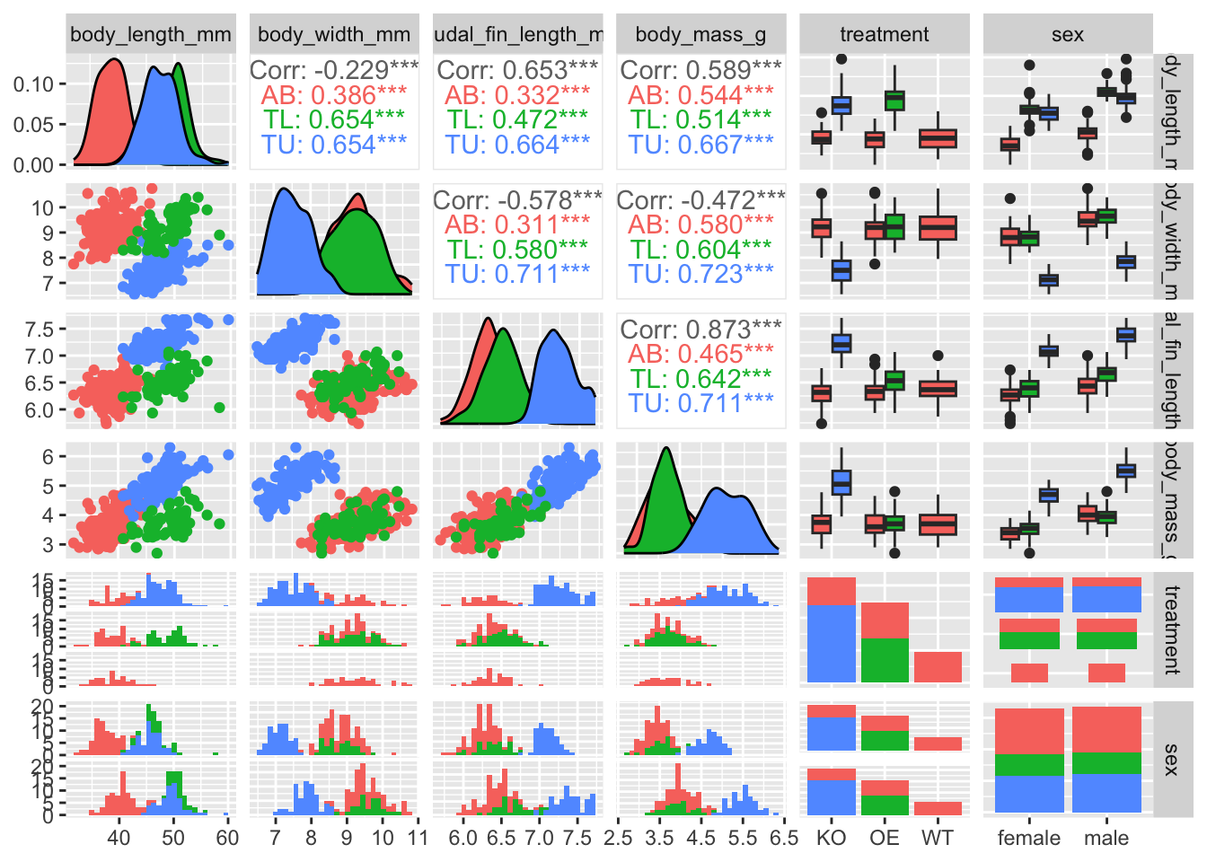
Step 8 | Principal Component Analysis (PCA)
Principal Component Analysis (PCA) is a dimensionality reduction method. It transforms a set of possibly correlated variables into a new set of variables called principal components (PCs).
TipMore about PCA
What does PCA do?
It creates new variables that are:
- Linear combinations of the original variables
- Uncorrelated with each other
- The first principal component (PC1) captures the largest amount of variance in the data.
- The second principal component (PC2) captures the largest remaining variance, and so on.
Typically, the first few PCs explain most of the variability.
** Why is PCA useful in exploratory data analysis (EDA)?**
In EDA, PCA helps you:
Reduce dimensionality Summarise many variables using only 2–3 components.
Visualise structure Plot PC1 vs PC2 to detect:
- Clusters
- Group separation (e.g., treatment vs control)
- Outliers
Detect technical effects Identify batch effects or unwanted variation.
Understand variable relationships Loadings show which variables drive each component.
Conceptual intuition
PCA finds the directions in the data space where:
- The data vary the most.
- The structure is most visible.
Instead of looking at each variable separately, PCA looks at overall patterns of variation.
PCA in one sentence
PCA is a mathematical tool that simplifies complex, multidimensional data so that we can explore patterns, structure, and variability more easily.
PCA calculation
For this analysis, we can use the stats::prcomp() function from base R, or a tidy version of it using the recipes package from tidymodels to perform a Principal Component Analysis (PCA).
For future use of the recipes package, follow this excellent article to get started with using tidymodels.
- Lets start by using the base R PCA function
prcomp().
#
# Compute PCA
#
pca_prcomp <-
  zebrafish_clean |>
  # select only numerical columns
  dplyr::select(body_length_mm, body_width_mm, caudal_fin_length_mm, body_mass_g) |>
  # scaling is very important in biomedical data where variables have different units
  prcomp(scale. = TRUE)

#
# Look at the object returned by the function
#
str(pca_prcomp)
List of 5
$ sdev : num [1:4] 1.657 0.882 0.607 0.328
$ rotation: num [1:4, 1:4] 0.454 -0.399 0.577 0.55 -0.6 ...
..- attr(*, "dimnames")=List of 2
.. ..$ : chr [1:4] "body_length_mm" "body_width_mm" "caudal_fin_length_mm" "body_mass_g"
.. ..$ : chr [1:4] "PC1" "PC2" "PC3" "PC4"
$ center : Named num [1:4] 43.99 8.58 6.7 4.21
..- attr(*, "names")= chr [1:4] "body_length_mm" "body_width_mm" "caudal_fin_length_mm" "body_mass_g"
$ scale : Named num [1:4] 5.469 0.985 0.467 0.805
..- attr(*, "names")= chr [1:4] "body_length_mm" "body_width_mm" "caudal_fin_length_mm" "body_mass_g"
$ x : num [1:333, 1:4] -1.85 -1.31 -1.37 -1.88 -1.92 ...
..- attr(*, "dimnames")=List of 2
.. ..$ : NULL
.. ..$ : chr [1:4] "PC1" "PC2" "PC3" "PC4"
- attr(*, "class")= chr "prcomp"summary(pca_prcomp)Importance of components:
PC1 PC2 PC3 PC4
Standard deviation 1.6569 0.8821 0.60716 0.32846
Proportion of Variance 0.6863 0.1945 0.09216 0.02697
Cumulative Proportion 0.6863 0.8809 0.97303 1.00000#
# Look at the loadings which show how each original variable
# contributes to each principal component
#
pca_prcomp$rotation PC1 PC2 PC3 PC4
body_length_mm 0.4537532 -0.60019490 -0.6424951 0.1451695
body_width_mm -0.3990472 -0.79616951 0.4258004 -0.1599044
caudal_fin_length_mm 0.5768250 -0.00578817 0.2360952 -0.7819837
body_mass_g 0.5496747 -0.07646366 0.5917374 0.5846861#
# Now lets plot the first two components
#
# Format as a data frame and add categorical variables
# Since prcomp() preserves row order, we can safely attach data variables
# (as long as no reorder or filtering of rows was performed before the PCA).
pca_scores <- as.data.frame(pca_prcomp$x) |>
bind_cols(zebrafish_clean |> select(strain, treatment, sex, year))
# Calculate the variance explained by each principal component
var_explained <- (pca_prcomp$sdev^2) / sum(pca_prcomp$sdev^2)
# Plot the Principal Components (PC1 and PC2)
pca_prcomp_plot <-
ggplot(pca_scores, aes(x = PC1, y = PC2)) +
labs(
x = paste0("PC1 (", round(var_explained[1] * 100, 1), "%)"),
y = paste0("PC2 (", round(var_explained[2] * 100, 1), "%)"),
title = "PCA: first two principal components"
)
# Combine plots using patchwork to compare PCAs colored by different variables
(pca_prcomp_plot + geom_point(aes(color = sex), size = 1.5, alpha = 0.7)) +
(pca_prcomp_plot + geom_point(aes(color = treatment), size = 1.5, alpha = 0.7)) +
(pca_prcomp_plot + geom_point(aes(color = strain), size = 1.5, alpha = 0.7)) +
(pca_prcomp_plot + geom_point(aes(color = year), size = 1.5, alpha = 0.7))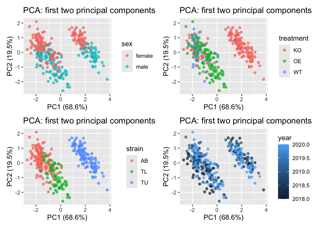
- Now the same PCA calculation but using the tidy version with the
recipespackage.
zebrafish_recipe <-
  recipe(~., data = zebrafish) |>
  update_role(strain, treatment, sex, year, new_role = "id") |>
  step_naomit(all_predictors()) |>
  step_normalize(all_predictors()) |>
  step_pca(all_predictors(), id = "pca") |>
  prep()

zebrafish_pca <-
  zebrafish_recipe |>
  tidy(id = "pca")

zebrafish_pca
# A tibble: 16 × 4
terms value component id
<chr> <dbl> <chr> <chr>
1 body_length_mm 0.455 PC1 pca
2 body_width_mm -0.400 PC1 pca
3 caudal_fin_length_mm 0.576 PC1 pca
4 body_mass_g 0.548 PC1 pca
5 body_length_mm -0.597 PC2 pca
6 body_width_mm -0.798 PC2 pca
7 caudal_fin_length_mm -0.00228 PC2 pca
8 body_mass_g -0.0844 PC2 pca
9 body_length_mm -0.644 PC3 pca
10 body_width_mm 0.418 PC3 pca
11 caudal_fin_length_mm 0.232 PC3 pca
12 body_mass_g 0.597 PC3 pca
13 body_length_mm 0.146 PC4 pca
14 body_width_mm -0.168 PC4 pca
15 caudal_fin_length_mm -0.784 PC4 pca
16 body_mass_g 0.580 PC4 pca The value column here is the loadings. For each component, the value tells us the linear combination of weights for each variable that contributes to that component.
Plot these loadings by principal component:
zebrafish_pca |>
  mutate(terms = tidytext::reorder_within(terms,
                                          abs(value),
                                          component)) |>
  ggplot(aes(abs(value), terms, fill = value > 0)) +
  geom_col() +
  facet_wrap(~component, scales = "free_y") +
  tidytext::scale_y_reordered() +
  scale_fill_manual(values = c("#addd8e", "#006837")) +
  labs(
    x = "Absolute value of contribution",
    y = NULL, fill = "Positive?"
) 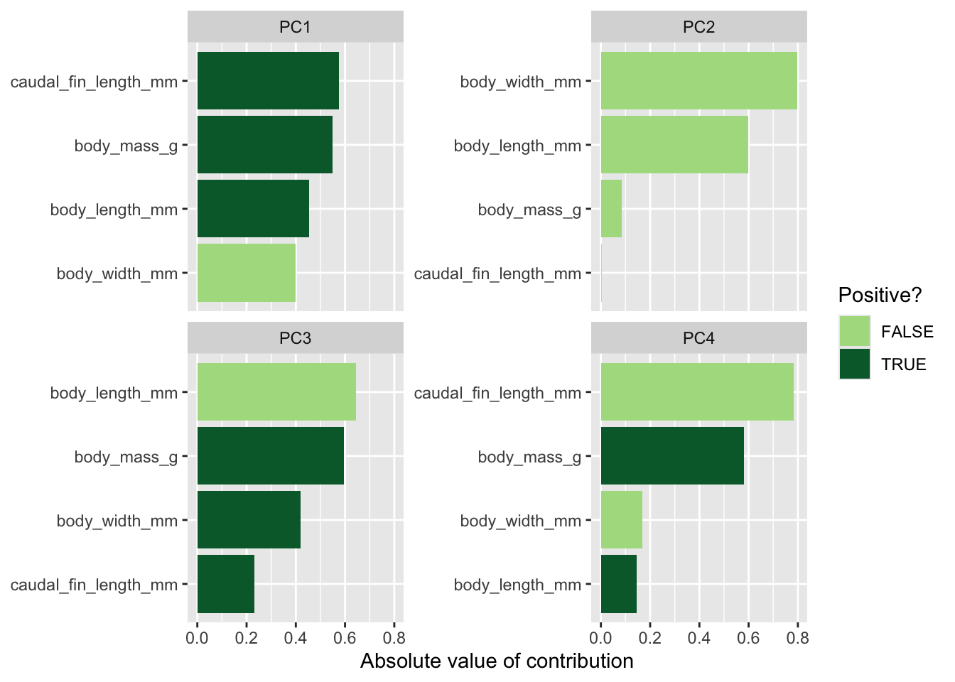
Plot PCA loadings + scores
# Format pca loadings to wide format
pca_wide <- zebrafish_pca |>
  tidyr::pivot_wider(names_from = component, id_cols = terms)

# Set the style of the arrows
arrow_style <- arrow(length = unit(.05, "inches"),
                     type = "closed")

# Plot the PCA
pca_plot <-
  juice(zebrafish_recipe) |>
  ggplot(aes(PC1, PC2)) +
  geom_point(aes(color = strain, shape = strain),
             alpha = 0.8,
             size = 2) +
  scale_colour_manual(values = c("#fe9929","#41b6c4","#f768a1"))

pca_plot +
  geom_segment(data = pca_wide,
               aes(xend = PC1, yend = PC2),
               x = 0,
               y = 0,
               arrow = arrow_style) +
  geom_text(data = pca_wide,
            aes(x = PC1, y = PC2, label = terms),
            hjust = 0,
            vjust = 1,
            size = 5,
color = '#0A537D') 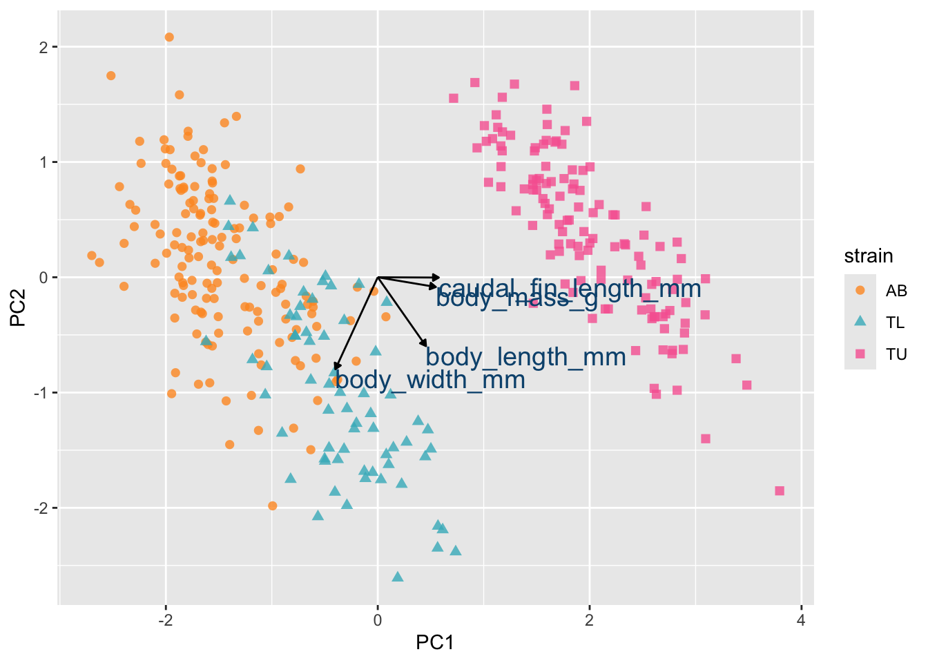
Step 9 | Synthesis and next analytical steps
From this EDA we observe:
- Clear morphological separation between strains.
- Evidence of sex-based differences.
- Strong correlations among growth-related traits.
- Multivariate clustering in PCA space.
- Risk of misleading interpretation when pooling data.
These observations suggest:
- Strain must be included in modelling.
- Sex may act as a covariate.
- Multicollinearity must be checked.
- Stratified analyses may be required.
EDA does not test hypotheses. It generates biologically grounded questions for modelling.
Conclusion
Exploratory data analysis is not a formal statistical test. It is a structured process of:
- Understanding the dataset.
- Identifying patterns.
- Detecting potential issues.
- Generating hypotheses.
In applied biomedical research, careful EDA prevents modelling errors and strengthens the interpretability of results.