library(tidyverse)Topic 6 | Polished Plots, Literate Programming, and the Data Descriptor
Class Details
Date: May, 2026
Synopsis: Presenting and polishing your exploratory plots, converting your analysis script into a reproducible Quarto report, and beginning your data descriptor manuscript.
Class overview: By the end of this class you will have: presented your EDA plots and received feedback, customised your ggplot2 figures with proper labels, themes, and annotations, converted your R script into a rendered HTML report using Quarto, and started drafting a data descriptor manuscript following the Nature Scientific Data template.
Timing guide
Two groups (Master’s students and PhD students) run independently, same structure.
| Segment | Duration |
|---|---|
| Plot presentations and feedback | 30 min |
| Polishing your plots | 30 min |
| From script to Quarto report | 30 min |
| Starting the data descriptor | 30 min |
| Total | **~120 min |
Plot Presentations and Feedback
In class 5 you produced at least two exploratory plots. Now you present them briefly to the instructor and receive feedback.
For each plot, explain:
- What question the plot was meant to answer.
- What you observed (expected or surprising).
- Any issues you are unsure how to handle (outliers, unexpected patterns, missing groups).
This is not a formal presentation. Think of it as showing your work in progress and getting a second pair of eyes on it. The instructor may suggest alternative plot types, flag misleading defaults, or point out patterns you missed.
Checkpoint
Every student should be able to show at least two plots and articulate what each one reveals about their data. If your EDA script does not run or plots are missing, fix that before moving on.
Polishing Your Plots
Exploratory plots are for you; communication plots are for your reader. The transition from one to the other is mostly about labels, scales, and visual clarity, not about making things “pretty” for its own sake. A well-labelled plot with a clean theme communicates faster than a default one with cryptic axis names.
We will work through three before-and-after examples using built-in R datasets. Each pair shows a quick exploratory plot followed by a polished version ready for communication. Pay attention to what changes and why.
Example 1: Boxplot | Labels, theme, and overlaid points
The iris dataset contains measurements of sepals and petals for three iris species. A boxplot comparing sepal length across species is a natural first look.
Exploratory version: the default gets the data on screen fast.
ggplot(iris, aes(x = Species, y = Sepal.Length)) +
  geom_boxplot()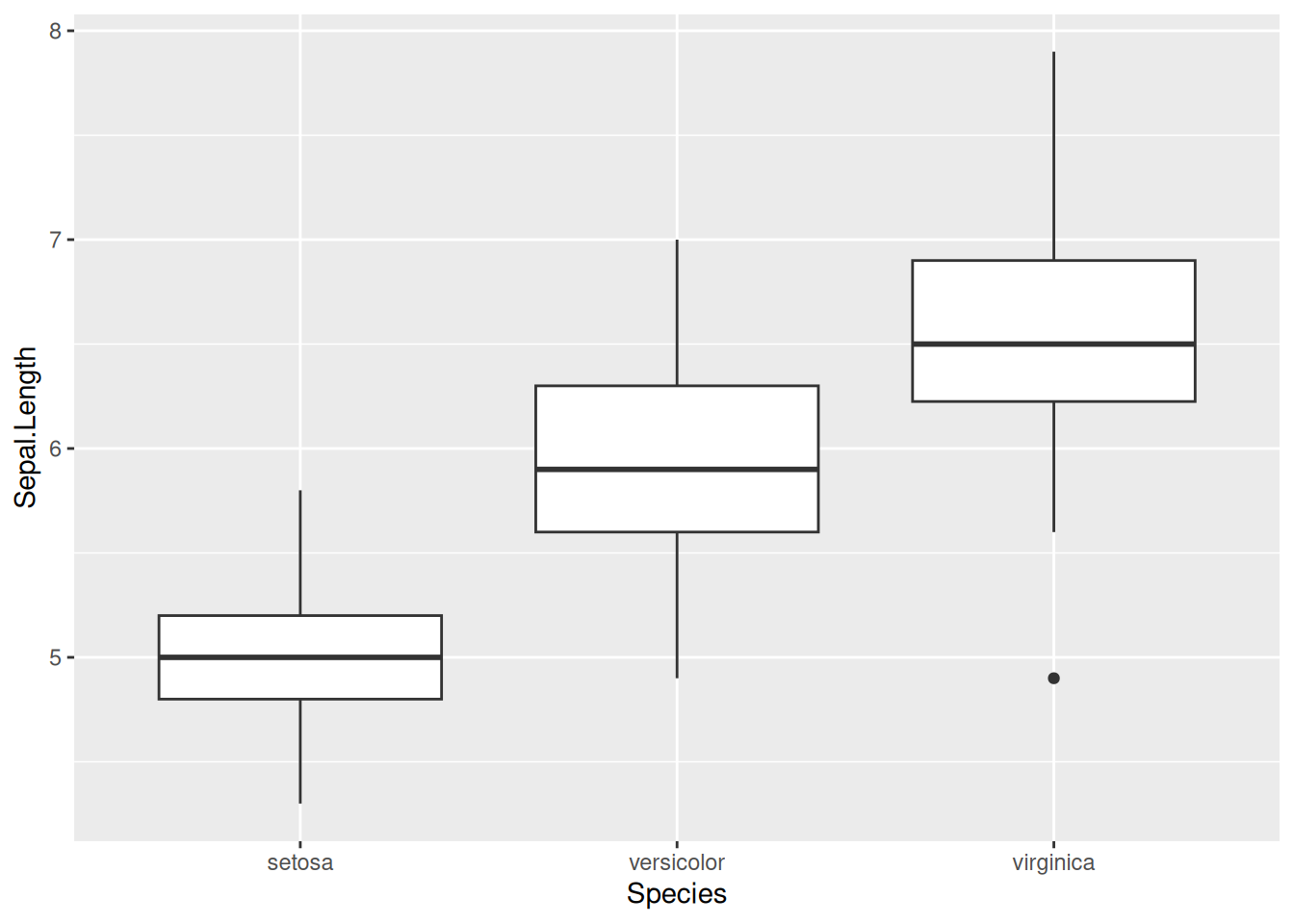
Polished version: axis labels include units, the title states the comparison, individual points reveal the sample size, and the grey background is gone.
ggplot(iris, aes(x = Species, y = Sepal.Length, colour = Species)) +
  geom_boxplot(outlier.shape = NA) +
  geom_jitter(width = 0.15, alpha = 0.5, size = 1.5) +
  scale_colour_brewer(palette = "Dark2") +
  labs(
    title   = "Sepal length across three iris species",
    x       = "Species",
    y       = "Sepal length (cm)",
    caption = "Source: Anderson (1935) iris dataset"
  ) +
  theme_minimal() +
  theme(legend.position = "none")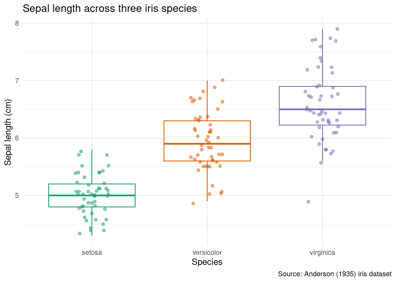
What changed and why:
- Axis labels now include units (
cm). A reader should never have to guess. geom_jitteroverlays individual observations - essential when group sizes are small, and informative even when they are not.outlier.shape = NAavoids plotting outlier points twice (once from the boxplot, once from the jitter).scale_colour_brewer(palette = "Dark2")replaces the default palette with a colourblind-friendly alternative.theme_minimal()removes the grey panel background.- The title says what the plot compares, not how it was made.
Example 2: Scatterplot | Colour scales and faceting
The mtcars dataset records fuel consumption and mechanical attributes of 32 cars. We can ask: how does fuel efficiency relate to weight, and does the number of cylinders matter?
Exploratory version:
ggplot(mtcars, aes(x = wt, y = mpg, colour = factor(cyl))) +
  geom_point()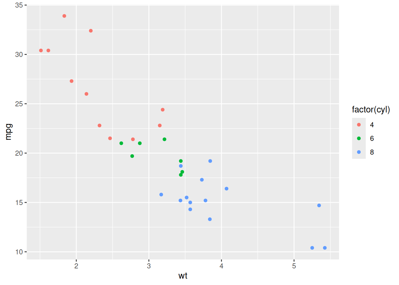
Polished version: meaningful labels, a clean palette, trend lines per group, and subtitle for methodological context:
mtcars <- mtcars |>
  mutate(cyl = factor(cyl, levels = c(4, 6, 8)))

ggplot(mtcars, aes(x = wt, y = mpg, colour = cyl)) +
  geom_point(size = 2.5, alpha = 0.7) +
  geom_smooth(method = "lm", se = TRUE, linewidth = 0.8) +
  scale_colour_brewer(palette = "Set2") +
  labs(
    title    = "Fuel efficiency decreases with vehicle weight",
    subtitle = "Linear trend shown per cylinder count",
    x        = "Weight (1000 lbs)",
    y        = "Fuel efficiency (mpg)",
    colour   = "Cylinders",
    caption  = "Source: Motor Trend, 1974"
  ) +
  theme_minimal()
`geom_smooth()` using formula = 'y ~ x'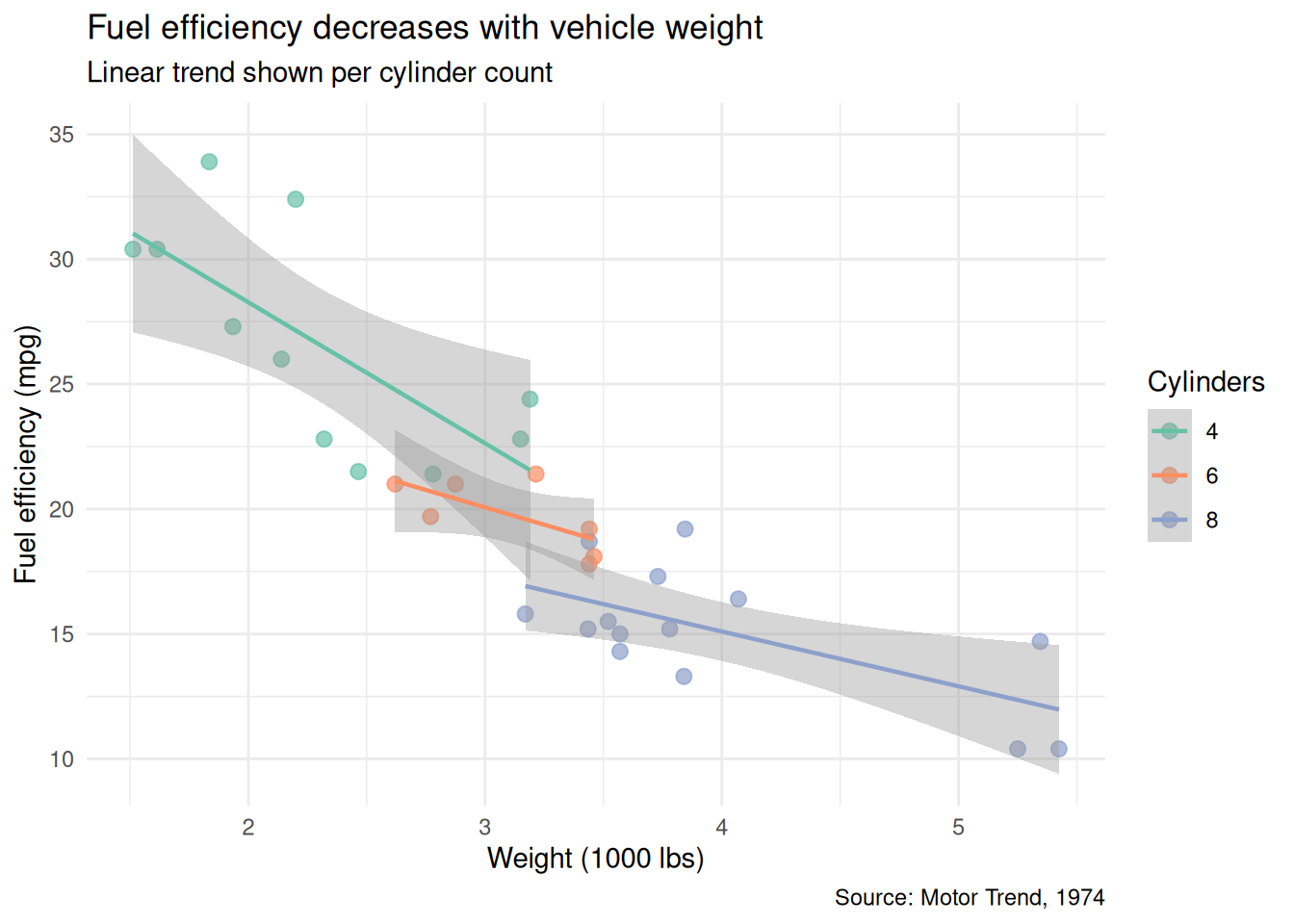
What changed and why:
cylis explicitly converted to a factor with ordered levels, so the legend follows a logical sequence (4, 6, 8) rather than alphabetical.geom_smooth(method = "lm")adds per-group trend lines that make the relationship visible at a glance.- The title states the finding, not just “mpg vs weight.”
subtitleexplains the trend lines so the reader does not have to guess.
Example 3: Faceted plot | Splitting by a second grouping variable
When two grouping variables are at play, faceting is often clearer than mapping both to colour and shape. Using ChickWeight (chick weights measured over time across four diets):
Exploratory version:
ggplot(ChickWeight, aes(x = Time, y = weight, colour = Diet)) +
  geom_line(aes(group = Chick))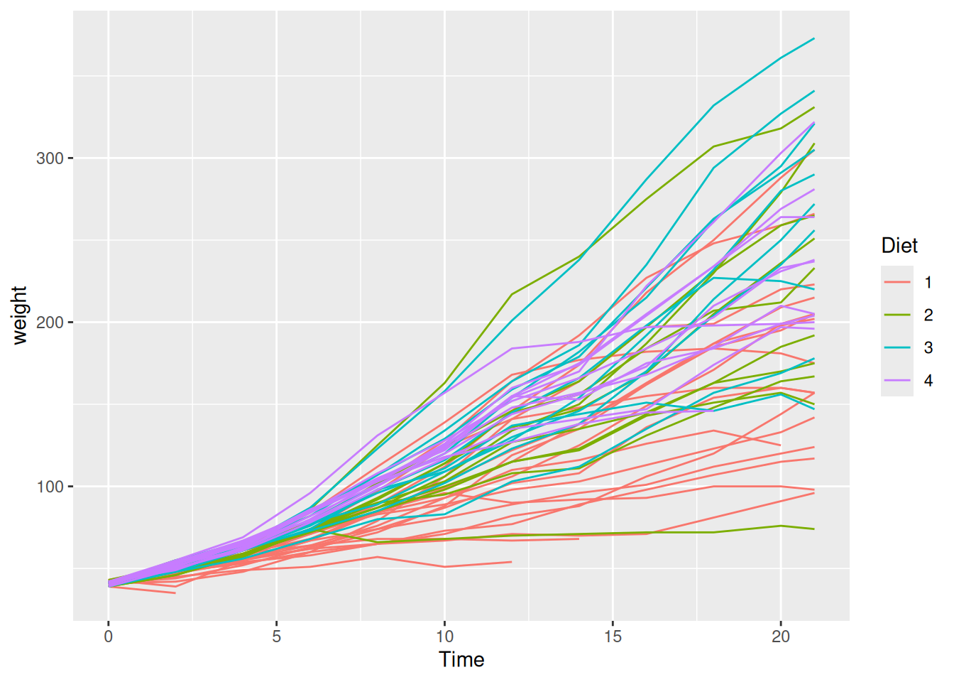
Polished version: facet by diet so individual trajectories are readable, add a group mean, and clean up:
# Compute diet-level summary
diet_means <- ChickWeight |>
  group_by(Diet, Time) |>
  summarise(mean_weight = mean(weight), .groups = "drop")

ggplot(ChickWeight, aes(x = Time, y = weight)) +
  geom_line(aes(group = Chick), alpha = 0.3, linewidth = 0.4) +
  geom_line(
    data = diet_means, aes(y = mean_weight),
    colour = "firebrick", linewidth = 1
  ) +
  facet_wrap(~ Diet, labeller = labeller(Diet = label_both)) +
  labs(
    title   = "Chick growth trajectories by diet",
    x       = "Time (days since birth)",
    y       = "Weight (g)",
    caption = "Red line = diet mean. Source: Crowder & Hand (1990)"
  ) +
  theme_minimal()
What changed and why:
- Faceting by
Dietseparates the spaghetti into readable panels. - Individual trajectories are drawn in light grey; the diet mean is highlighted in red. This layering lets the reader see both individual variation and the overall trend.
labeller = labeller(Diet = label_both)prints “Diet: 1”, “Diet: 2”, etc. in the facet strips, making each panel self-explanatory.
Saving plots
Save your polished figures to outputs/ at a resolution suitable for documents and presentations.
ggsave(
  "outputs/sepal_length_by_species.png",
  width  = 18,
  height = 12,
  units  = "cm",
  dpi    = 300
)
Individual activity
Take one of your EDA plots and polish it following the patterns above: replace default labels with descriptive text and units, choose a colourblind-friendly palette, and save it to outputs/. This is the version you would include in a report.
From Script to Quarto Report
So far, all your analysis lives in .R scripts. Scripts are reproducible - anyone can run them, but they do not explain the reasoning behind the analysis. A reader sees what you did, but not why you did it or what you concluded.
Quarto solves this by letting you combine prose and code in a single document that renders to HTML (or PDF, or Word). This is called literate programming: the analysis and its narrative live together, and both are produced from the same source file.
Why this matters for reproducibility
A script says: “run these commands.” A Quarto report says: “here is the question, here is what we did, here is what we found, and here is the code that produced it.” When you or someone else revisits the project in six months, the report is self-explanatory in a way that a script with scattered comments is not.
Create your first .qmd file
- In RStudio:
File > New File > Quarto Document. - Set the title (e.g., “Exploratory Data Analysis”), your name as author, and choose HTML as the output format. Click “Create”.
- Save it in the root of your project as something like
eda_report.qmd.
Anatomy of a .qmd file
A Quarto file has two components: a YAML header and the body.
The YAML header controls the output format and metadata:
---
title: "Exploratory Data Analysis"
author: "Your Name"
date: today
format:
  html:
    toc: true
    code-fold: true
---
The body mixes Markdown prose with code chunks. Prose is written as plain text with Markdown formatting. Code chunks are fenced with backticks and a language tag:
## Summary Statistics

Below we compute summary statistics per treatment group.

```{r}
library(tidyverse)

tidy_data <- read_csv("data/processed/my_data_tidy.csv")

tidy_data |>
  group_by(group) |>
  summarise(
    n    = n(),
    mean = mean(response, na.rm = TRUE),
    sd   = sd(response, na.rm = TRUE)
  )
```
Chunk options
You can control what appears in the rendered output with chunk options. Place them at the top of the chunk with the #| prefix:
#| label: fig-boxplot
#| fig-cap: "Enzyme activity by treatment group."
#| echo: true
#| warning: false

ggplot(tidy_data, aes(x = group, y = response, colour = group)) +
  geom_boxplot(outlier.shape = NA) +
  geom_jitter(width = 0.15, alpha = 0.5) +
  theme_minimal()
Common options:
echo: true/echo: false- show or hide the code.warning: false,message: false- suppress package loading messages.fig-cap- add a figure caption.label- give the chunk a name (useful for cross-referencing).
Render the report
Click the “Render” button in RStudio (or press Ctrl+Shift+K / Cmd+Shift+K). Quarto runs all code chunks in a fresh R session and produces an HTML file in the same directory.
Important
The report must render from a clean session. If it fails, that means your analysis depends on objects or packages loaded in your current environment but not declared in the .qmd file. This is exactly the kind of hidden dependency that literate programming is designed to catch.
Convert your EDA script
Your task now is to migrate the content of scripts/02_eda.R into a .qmd file:
- Create
eda_report.qmdwith the YAML header above. - For each section of your script (data loading, summaries, each plot), create a code chunk preceded by a short paragraph explaining the purpose and what you found.
- Render to HTML and verify the output.
You are not writing a thesis - a sentence or two per section is enough. The point is that each code chunk has context.
Tip
Use code-fold: true in the YAML header. This keeps the rendered report clean for readers who care about results, while still letting them expand any chunk to see the code.
Starting the Data Descriptor
In class 4, you browsed Nature Scientific Data and saw how professional data descriptors document a dataset. Now you begin writing your own, using the journal’s official Word template.
The template .docx file can be downloaded here. Save it to the root of your project (or to docs/) and open it in Word or LibreOffice. Briefly look at it.
What a data descriptor is (and is not)
A data descriptor is not a full research paper. It does not test hypotheses or draw conclusions. Its purpose is to describe a dataset in enough detail that someone who has never seen it can understand its structure, evaluate its quality, and decide whether to reuse it.
Think of it as the documentation you wish every dataset came with.
Sections to start drafting
You do not need to complete the manuscript today. Focus on the sections where you already have the material:
- Title - a concise description of the dataset, not the research question.
- Abstract - a brief summary of what the dataset contains, how it was collected, and what it can be used for.
- Background and Summary - the context that motivated data collection, and an overview of what the dataset covers.
- Methods - how the data was collected, processed, and quality-controlled. This is where your tidying script is relevant: the transformations you applied are part of the data processing pipeline and should be documented.
- Data Records - a description of the dataset structure: files, columns, types, units, and what each variable represents. The variable table you added to your README in class 4 is a starting point.
- Technical Validation - any checks you performed to verify data quality (range checks, consistency, expected group sizes). Your EDA from class 5 feeds directly into this section.
Note
The template contains additional sections (e.g., Usage Notes, Code Availability). You can leave those empty for now and fill them in as the project progresses.
Connecting back to your project
Notice how each section of the data descriptor maps to something you have already done:
- Methods - your R scripts (
scripts). - Data Records - your GitHub repository.
- Technical Validation - your EDA script and plots.
The data descriptor is not extra work layered on top of your analysis: it is the narrative that ties your existing work together into a coherent document.
Individual activity
Open the template and begin drafting the Title, Abstract, and Data Records sections. Use your scripts and EDA results as source material. You will continue refining this document in the remaining classes.
Commit, Push, and Wrap-up
Commit your work
- Stage your updated files: the polished plot in
outputs/, the neweda_report.qmdand its rendered HTML, and the data descriptor draft. - Write a meaningful commit message, for example:
"Add Quarto EDA report and begin data descriptor draft". - Commit and push to GitHub.
What was accomplished today
- You presented your plots and received feedback.
- You polished at least one plot with proper labels, colors, and export settings.
- You converted your analysis script into a Quarto report that combines prose and code into a reproducible HTML document.
- You began drafting a data descriptor manuscript using a professional template.
What comes next
The next class will continue developing the data descriptor and the Quarto report, incorporating any statistical analyses appropriate for your dataset.
Homework
- Complete the migration of your EDA script into
eda_report.qmd. Every code chunk should have a short explanatory paragraph. The report must render without errors from a clean R session. - Continue drafting the data descriptor: complete at least the Title, Abstract, Background and Summary, and Data Records sections.
- Polish all your plots and save them to
outputs/. - Commit and push.